Tuesday, December 27, 2005

Tony Hancock

Father Christmas brought me a lovely, tiny sketchbook, four inches square. I was watching a program about Tony Hancock on television last night, and it struck me what a wonderful sketchable face he had -- gentle and full of expression. I haven't yet perfected the art of either sketching from life, or sketching from memory (hi Doug), but as luck would have it, the Radio Times had published an old photo of him to advertise the program. So this has become the first sketch in my new sketchbook.

I hope to carry this book around with me much more than my old sketchbooks, and so hopefully I'll be able to sketch more when the mood takes me, without having to worry about being in the right place with the right materials. Posted by Picasa

Friday, December 23, 2005

A Christmas sketch

My first day off work, and I've managed to spend the afternoon sketching!

I got the idea for this piece about a week ago after seeing a picture hanging in the window of a gallery in Cambridge. The painting of the woman had simple lines and bold colours, and I wanted to see if I could achieve the same effect.

Eventually, I'd like to do this as an acrylic, but for now it's just a pencil sketch, with the outline drawn over in dark charcoal (which unfortunately smudged a little). The colours aren't quite right -- I'd like to get a more vivid mix of red, orange, and blue than I've achieved here --but they're along the right lines.

Since it's Christmas, and this will be my last post for at least a few days, let's call her Mary.

Have a happy Christmas! Posted by Picasa

Update: If you'd like to read an article about how I developed this picture further, click here.

Wednesday, December 21, 2005

Last minute Christmas presents

Now this is a real treat. Go and have a look at Liz Plummer's blog, and in particular at this entry on how to make a concertina book. And if you're feeling crafty, and still need to get a few last minute Christmas presents, then look no further. As soon as I get a chance, I'm going to try this at home.

Tuesday, December 20, 2005

Sketchbook of Russ Stutler

I have just, via Moleskinerie, come across the Sketchbook of Russ Stutler. I must say, this is a fantastic site for anyone with an interest in sketching, and Russ's sketches are full of life, colour, and lovely to behold. As well as beautiful sketches, his site also includes a lot of information on materials and tools, and gives a good insight into the way he works. Fascinating reading.

In addition to his sketchbook, Russ also has a number of comics available, and a sketching discussion page, which features some articles he's written, and a wealth of links to other sketching resources.

Highly recommended if you fancy losing yourself for a while.

Wednesday, December 14, 2005

Sketches from my Moleskine

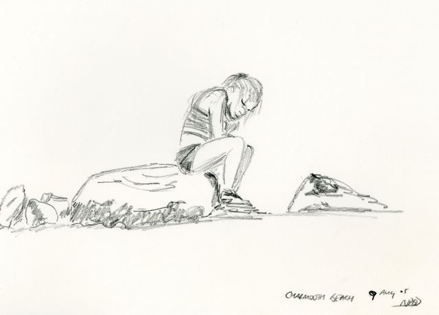
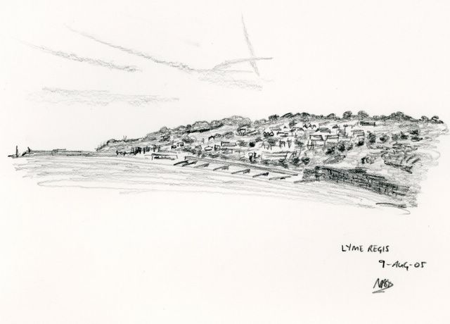
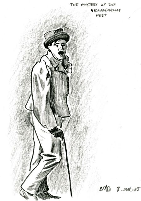
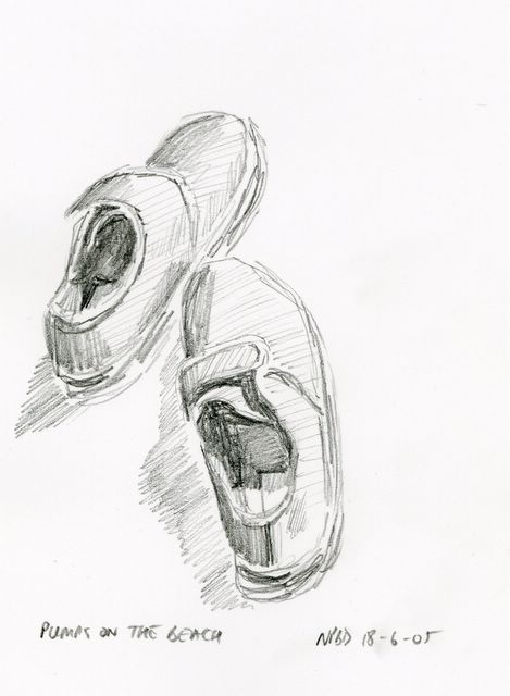
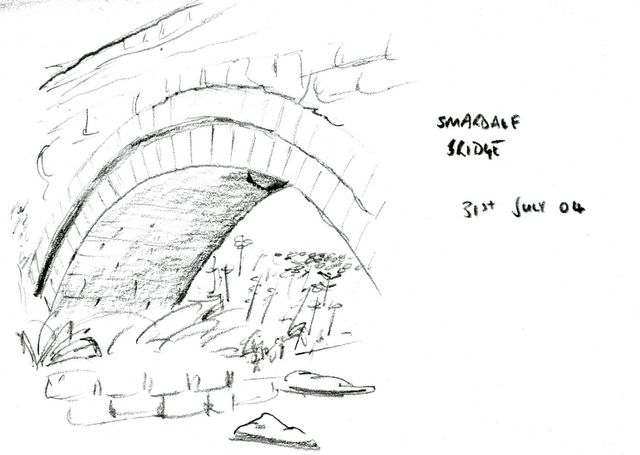
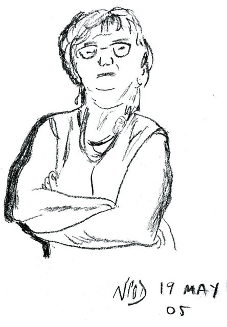
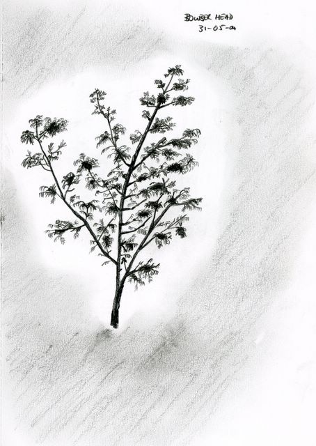
It's been a while since I posted anything from my Moleskine. In fact it's been a while since I posted anything at all; I've never been the most prolific sketcher in the world. So here's four in one post for you, all recent entries into my Moleskine.

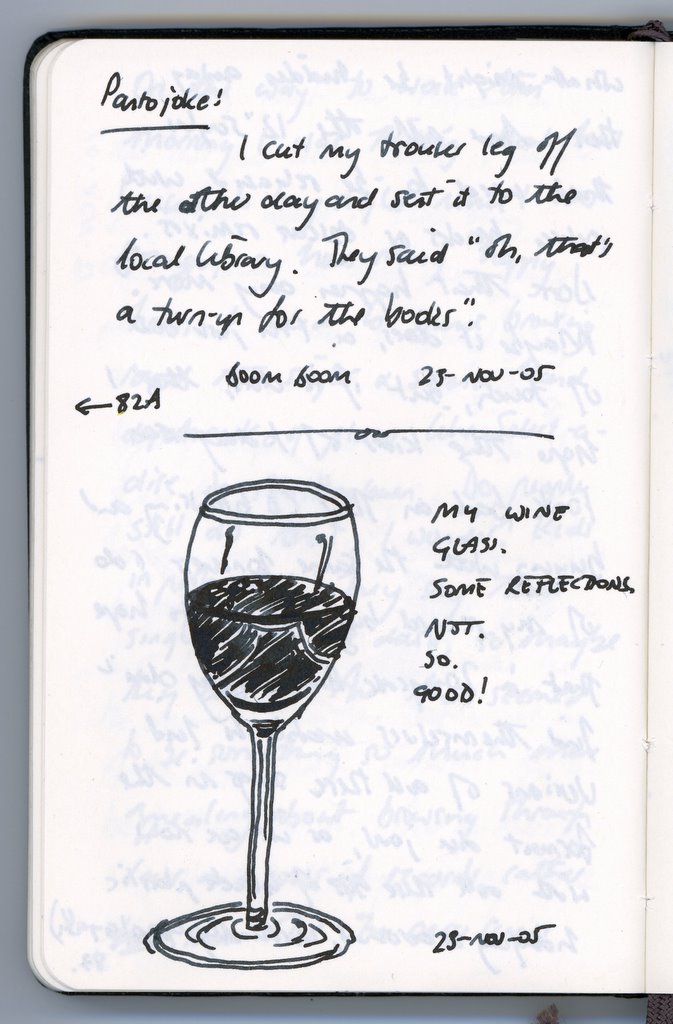
First up, a pen sketch of my wine glass that I did quickly a couple of weeks ago as it sat on the coffee table. There were some interesting reflections in the glass, and I wondered how easy it would be to capture them quickly. Umm, it wasn't.

Anyway, as a little extra, there's also a bad joke for you to groan at (though you may have to click the picture to see the larger version in order to be able to read it). If anyone from the UK is in the middle of putting on a pantomime at the moment, you can have that one on me! (As I understand it, most people from outside the UK have yet to discover the joys of a good pantomime at Christmas ...)

You might notice the pointer from the joke back to another page. Yes, I have more of these! I tend to write them down as I hear them. They're never original -- pantomime jokes should never be original.


Next is a doodle which, strictly speaking, isn't a Moleskine doodle: I just stuck it into my Moleskine because I kind of liked the shading, and the way the shadows in the guy's face blended into the random bits of shading. As the note in the Moleskine says (if you can be bothered to read it), this was really the result of me scribbling to try and get my Pilot mini gel pen working again. I carry it around with my Hipster PDA (I hate that term) in my back pocket, and it tends to get full of fluff. Bonus points if you can identify the words that I've scribbled over ;-)

If you like sketches with beautiful shading, by the way, you should check out the sketches Mike Rohde has posted on his blog. He does this sort of thing so much better than me. Hey Mike, if you're reading this, it's a long time since you posted any sketches!


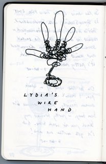
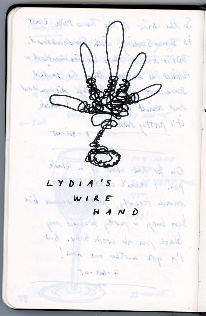
Now this strange looking thing is actually more true-to-life than you might first think. My wife (who, you might remember, is studying for an Applied Arts degree), made this fantastic wire sculpture a few days ago based on her hand. She can't make up her mind what to do with it, though I think she's currently thinking in terms of "skinning" it using the stuff you use to make plaster casts. Anyway, there's this fantastic bare wire hand sitting on the coffee table. I thought "hey, that's all one piece of wire, I could draw that with one continuous line", so I did. While I was doing this, I found myself thinking about the differences in the way my 2D sketch was composed, versus her far more complicated 3D "sketch". In particular, it mattered far less to me what order I drew each part, whereas for her sculpture it was absolutely crucial. And I could take shortcuts: the springy spirals around the base were just drawn over the top of the line representing the stand, for example, whereas she had to spend a lot of time curling wire round and round the base, creating the spring ... All a bit obvious, perhaps, but interesting to think about these sorts of differences.


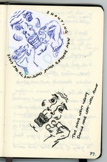
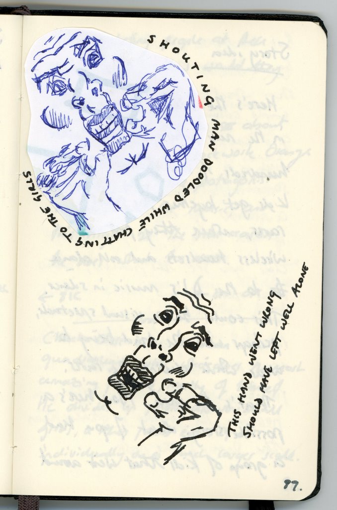
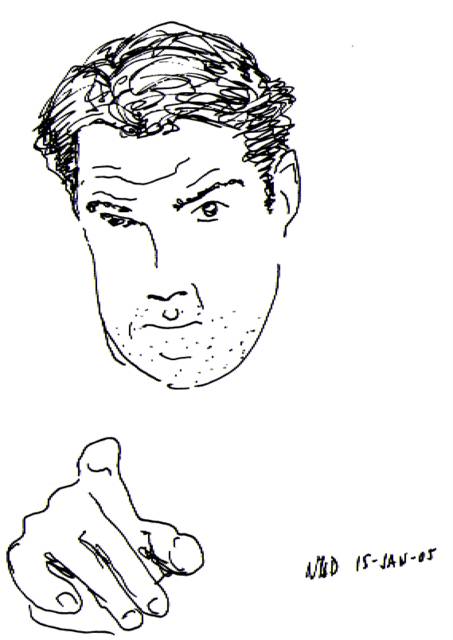
And finally, a lesson on when to leave well alone. I was chatting to my girls a few evenings ago, and there was a ballpoint and some paper on the table in front of me, so I started to doodle while they told me about their day. It started off as a sketch of my youngest's hand, but, as usual, she never keeps still enough. The hand ended up looking cupped, and though I didn't particularly like it, it put me in mind of someone shouting. So that's what I ended up doodling -- a shouting man. I didn't like the hands, but I did quite like his comic-book face, and the mouth in particular. Yup, that's a keeper, so I'll stick it in the Moleskine.

And there I should have left it. But no, I decided it would be nice to repeat the exercise in the Moleskine itself, but in black ink this time. Like the doodle, I was looking for something quick and instinctive, but I ended up with something that was just rubbish. I started with the hand again (why?), and it didn't even look like a hand. Then I started on the face, and he just ended up looking scared. At this point, I gave up, annoyed with myself for not stopping with the original doodle.
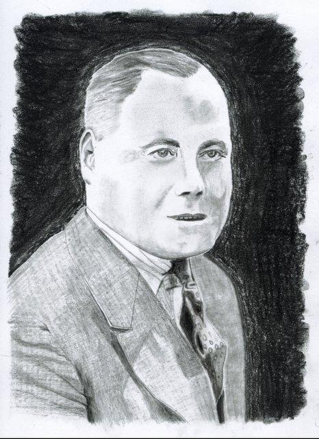
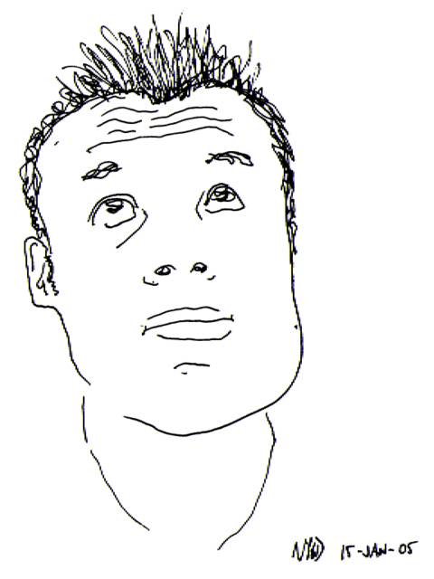
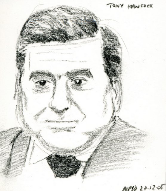
Tuesday, December 06, 2005

Turner Prize

So Simon Starling has won this year's Turner Prize with Shedboatshed. Another installation that keeps the controversial flame of the Turner Prize burning brightly. Personally, I've never been much of a fan of the material that typically gets nominated for the Turner Prize, but that doesn't mean I have anything against the prize itself. Personally, though, I preferred Gill Carnegie's Red, which apparently is one in her series of "bum paintings", and certainly offers more in the way of erotic imagery than Shedboatshed does. Well, for me, at least.

Monday, November 28, 2005

BBC's Mock Turner Prize

For the last two years, the BBC has put on what it calls the Mock Turner Prize, at the same time that the real Turner Prize is chosen. Of course, they intend it as a tongue in cheek parody of the real Turner Prize, but nevertheless it turns up some genuine pieces of art. Take a look at the main page to see this year's finalists. I voted for this one, which rather put me in mind of my parasol piece.

Which reminds me, if you do a Google image search for "parasol", mine is the third result returned, which is kind of neat.

Friday, November 18, 2005

Word verification

I've turned on word verification for comments to Mr Porkpop, in order to avoid comment spam. Although I wasn't getting as much of it as some other people, I was getting enough that it was becoming annoying. So now, if you add a comment, you'll have to verify that you're a real person typing a real comment by typing in a string of random letters that are shown to you on the screen. Sorry about having to introduce this extra step, but it's become necessary.

Thursday, November 03, 2005

Curse of the imagination

As the husband of a ceramicist, I can relate to the false expectations built up by the Curse of the Imagination, as described by Grayson Perry in this week's article in the Times. I don't think it's just limited to ceramicists, however. I know how disappointed I can feel if something that I imagine in my mind doesn't come out the way I intended on paper.

Thursday, October 20, 2005

Chelsea Crafts Fair 2005


A change this week: words, rather than pictures.

Last weekend (Sunday to be precise) my wife and I made the journey into London for the Chelsea Crafts Fair. A trip to London is a fairly rare thing for us these days (although this year, as chance would have it, we've made several), and neither of us had been to this particular fair before, but is was an experience well worth having.

The main reason for our visit was that my wife has recently started a part-time Applied Arts degree at the University of Hertfordshire. In the field of applied arts (up until now she has been purely focused on ceramics), this is one of the biggest fairs of the year. I just fancied going along for the ride, seeking an excuse for inspiration.

The Chelsea Crafts Fair is for buying and selling pieces, rather than being a trade fair of the sort that you can buy raw materials from, so we really went with the intention of looking at some beautiful work. We weren't feeling rich enough to want to part with money (and nor did we). What was so nice, though, is that almost without exception, the artists who were exhibiting were more than happy to explain their methods, talk through pieces, and so on.

The Chelsea Crafts Fair has a huge diversity of artists exhibiting. There are ceramicists, jewellers, textile artists, book and paper-makers (anyone who has followed this blog for any length of time will appreciate how much these appealed to me), glassworkers ... the list is almost endless.

So, who inspired me the most? There were so many beautiful works there that it seems unfair to single out a single artist, but I have to say that I was bowled over by the work of Michelle Holden (pictured left), who makes things from paper and material, especially from the pages of old, discarded books. She can take an old piece of paper and somehow make it come alive with flowers, or turbines, or just random shapes, in a way that has to be seen first hand to be appreciated. Sadly, she seems to have very little in the way of a web presence, but if you find her in the list of exhibitors at the Chelsea Crafts Fair website, you'll find her contact details.

The Chelsea Craft Fair is on for two weeks, and the nice thing is that the exhibitors in the second week are completely different from the first. If you happen to be in London in the next few days, I highly recommend a trip there, though don't expect to see the work of Michelle Holden. The Fair is on until 23rd October.

Friday, October 14, 2005

Sketches by Ullswater

Here are some sketches I did "in the wild" while on holiday last year. I'm generally pretty bad at sketching people (or any moving objects, for that matter) from real life, but this was one occasion when things seemed to come together. I liked the ghost-like quality of the silhouettes.

The main figures are my wife and children, poking about by the side of the lake looking for tiddlers while I sketched. A few hundred yards away, some kids were throwing themselves into the water from a low cliff-face. It looked terribly dangerous, but they kept coming back for more. Posted by Picasa

Wednesday, October 05, 2005

Dad

I seem to have had so little time for sketching lately that I'm having to look back at my old stuff. Here is a very old sketch that I did of my father several years ago, as a birthday present for my mother.

You can see the original in my other blog, which, one day, I will add some real content to. Posted by Picasa

Friday, September 23, 2005

... I know what I like

Grayson Perry's new regular column on the arts in the Times has made for some good reading in the last few weeks. In this week's article he talks about the pressure to conform to artistic "good form" when deciding what's in, and what's not.

Am I alone in thinking that there is too much “good taste” around these days? People seem to make fewer eccentric “mistakes” in dress and decor. Are things blanding out? Does everyone need to be told what’s beautiful? Can’t we tell for ourselves any more?

Wednesday, September 21, 2005

Article over at D*I*Y Planner

OK, the cat's out of the bag. One of the reasons this blog has been a bit quieter in the last few weeks is that I've been turning my attention a little bit more to the written word.
Dr. Moleskine, or: How I Learned To Stop Worrying and Love My Journal is the result of this and, I think, is the first article I've written for the internet that hasn't been self-published. I'd love it if you hopped over there to have a read, and while you're at it, have a browse around the rest of DIYPlanner.com, which is fast becoming a home to a vast array of useful and entertaining material.

Tuesday, September 20, 2005

D*I*Y Planner: Surfing the Alpha Waves

Surfing the Alpha Waves is an excellent post over at DIYPlanner.com by site-host Douglas Johnston on harnessing your creativity. I heartily recommend it to anyone who needs to turn on that spark of creativity in whatever they do. Rather than waiting for the muse to strike you, here are some ideas on how you can go and look for it yourself.

Monday, September 19, 2005

OK, never one to shy away from posting stuff I'm not so keen on, here's the one I was going to post. One thing that I'm really not very good at is sketching people (or animals) from real life. I don't know whether it's something I should persevere with, or whether I should just stick to taking photos and sketching them, but this picture of my youngest daughter on Charmouth beach in Dorset is typical. She was examining the rocks around her, looking for fossils (unsuccessfully). To me, she looks like she's sitting sulking. It doesn't even look like her. Ah well, I'll post it anyway.

Trainer

Here's an oldish one I came across yesterday from my trusty Moleskine notebook. I was sitting down in the living room one evening, having just got back from work, and I felt like doodling something. My trainer was in the middle of the living room floor, my Moleskine was sitting next to me, and there's just something nice about drawing shoes, don't you think? This picture is better than the one I was going to post, anyway.

Friday, September 09, 2005

Slowing down the artistic process

I can't admit to being a great fan of his work, but this article by Grayson Perry in yesterday's Times is interesting reading, and a lot of what he says makes sense. His basic premise is that, because of the appetite for art by the public, the artistic process has speeded up, and that artists should think about slowing down a little, at least sometimes.

Art-world acceleration I put down to various forces. First, we are just as prone to being sucked into the idea that fast is somehow central to modernity. To be relevant is to be broadband-quick and dressed for next season. Apparently artists also need to become museum-supply companies with a high turnover of works if they want to succeed internationally.

It's an interesting article. Go and have a read.

Link

Wednesday, September 07, 2005

Here's another sketch drawn on the beach while on holiday. The village of Charmouth has a wonderful, fossil-filled beach, and a great view of Lyme Regis, just along the coast. Lyme Regis is probably most famous as being home to the pier in John Fowles' "French Lieutenant's Woman", and you can see that pier here. From this distance, practically every building in Lyme Regis seemed to be surrounded by trees, and I tried to mirror this in the sketch. The sky had just the lightest haze, with the vapour trails being the most dominant feature.

Thursday, September 01, 2005

It's been a while since I had the chance to post anything to the blog, what with one thing and another, but I've finally got round to scanning in the sketches I did while in Dorset. The Dorset coast, famous for its fossils, consists of wildly varying coastlines that I found very difficult to recreate, but here goes anyway. Here's a picture of Lulworth Cove taken on a fairly overcast day. The cove is almost completely circular, and makes for a quiet haven for wildlife and man alike. Dozens of boats (there were far more than I sketched) spend their lives moored there, bobbing quietly up and down. A very relaxing place.

Tuesday, July 26, 2005

I'll be on holiday from the end of this week for most of the next three weeks, so my ability to upload stuff to the blog will be sporadic, at best. I'll try and squeeze one or two extras in this week before I go.

This is a sketch I did from an old photo of my father, as a young man. He's dressed in costume for a play, though I don't know which one. This is one of my favourite photos of my father, and sits on our mantelpiece in the living room. It was one of those spur of the moment sketches - the kind where you sit down after returning from work and just pick up a pad and a pencil without any real idea of what you're going to do with it. I was pleased with the result because I have tried - and failed - in the past to do a more careful drawing from this photo. This was relatively quick to draw, but also had a spark that was missing from my previous attempt.

Tuesday, July 19, 2005

A particularly misty, hot afternoon by the side of Crummock Water nearly two years ago. Thoughts of impending holidays sending me back to memories of past ones this morning ...

Wednesday, July 13, 2005

Nothing new to upload this week, so I thought I'd upload this old sketch I made of the sunset over our back garden. One of the benefits of living in a very flat area is that you get a lot of sky, and it quite often looks like this in the evenings. As far as the sketch itself is concerned, it's mostly pastel, though the line of the silhouette itself was done using an ink pen to bring out the detail. Look for the bird sitting in the tree.

Wednesday, July 06, 2005

My first "proper" watercolour. I painted this a couple of weeks ago. Sometimes you have a moment where it just all comes together, and I think this was one of those. On our recent holiday, I took a picture of my eldest daughter, and it was completely out of focus. However, I quite liked its composition, and the most powerful thing about it was this lovely blue eye which served as the centre of the picture, so I cut out all the colour from the picture except for that eye. Suddenly, a bad photo was turned into a more interesting photo, and I figured it would make a nice pastel. Then I was given my new watercolour set, so I decided to have a play with those instead. This is the result.

Friday, July 01, 2005

New sidebar links

Just a quick post to alert you to the fact that I've updated my "Blogs of note" links in the sidebar on the right, to add a couple more of my daily visits. I recommend you try them out. I try and keep this list reasonably small: rather than going all out and listing, say, everything I keep in my Bloglines account, I just like to hand-pick a few of the more unusual and entertaining blogs. Yup, I visit BoingBoing too, but everyone links to them ...

Thursday, June 30, 2005

Parasol

Here is a pastel I drew some time ago. The situation and place are pretty unimportant as far as the drawing is concerned (though it was based on a photo taken on the beach at Holme-Next-The-Sea in Norfolk): it was the simplicity of the layout and the colours used that I liked.

I tried to do a larger version of this, making the colours brighter and cleaner, but it all went horribly wrong and I never finished it. In that picture, I tried laying down a base layer of acrylic to strengthen the colour of the pastels I placed on the top, but I wasn't careful enough and was never able to subsequently cover up my errors. Ah well. Maybe I'll go back to it one day.

Friday, June 24, 2005

Make poverty history

I think this is a worthy enough cause to take a short break from the usual sketching fodder. Since the G8 Summit is taking place in the UK, I figure the least I can do is post the message below, which comes courtesy of the G8 REBOOT website (link in the title above):


Make Poverty History

Every single day, 30,000 children die, needlessly, of extreme poverty.

On July 6th, we finally have the opportunity to stop that shameful statistic.

8 world leaders, gathered in Scotland for the G8 summit, will be presented with a workable plan to double aid, drop the debt and made the trade laws fair. If these 8 men agree, then we will become the generation that made poverty history.

But they'll only do it if enough people tell them to.

We don't want your money - we want you!

Visit these sites to find out more:

Thursday, June 23, 2005

And while they carried on looking for stones, I carried on sketching. Here is a picture of Seaford Head: a view that I have photographed many many times, but not drawn until now. It might be nice to do this one as a watercolour some time.
Beautiful weather here in the UK at the moment. Went swimming in the sea on the South Coast on Saturday, and afterwards, while the girls gathered interesting stones, I sat and sketched their pumps drying in the sun. I like the loose style of this, and the contrast between the dark shadows on the inside of the pumps, and the brighter areas where the sun shone on them. Amazing how something that is black can provide such a range of tones.

Monday, June 20, 2005

Father's Day

Well, this weekend was Father's Day in the UK. Not traditionally an event that we as a family make a great deal of fuss over. But this year, my two lovely girls proudly presented me with a beautiful Cotman Painting Plus Watercolour set.

Now, I know very very little about watercolour painting, but I've wanted to learn for a while. With luck, I'll be able to put some of the results of my trials up here on the blog in the coming months.

Thursday, June 16, 2005

Here's a sketch I drew while on holiday last year of Smardale Bridge. In the 1700s, this used to be on the main road between Kendal in the Lake District, and Kirkby Stephen, in the Eden Valley; this was one of the main East-West routes in the UK. There was a coaching inn right by the bridge. Now, the bridge is in the middle of nowhere, the road and the coaching inn have crumbled to the ground. You pass this bridge when you walk from the village of Ravenstonedale to Smardale Viaduct (a Victorian railway viaduct, again, disused now). We sat and had our lunch by the bridge, and while the others looked at flowers and insects, I sketched.

Monday, June 13, 2005

Back to sketches after a bit of a break. Here's my daughter's handbag, sketched just as it lay on the table while we were on holiday. Surrounded by the beauty of Cumbria, and I draw my daughter's handbag. You've got to smile.

Wednesday, June 08, 2005

Well, it's not very often you get to see the Queen, but I just did, on the streets of Cambridge, about half an hour ago. I managed to take a snap with my camera phone and thought it was worth blogging about!

Saturday, May 28, 2005

No posts for a week

We're about to go up to the caravan in Cumbria for a week, so there won't be any postings for a while after Friday. Hopefully I'll come back with my mind refreshed and my sketch books full! I did have a nice pastel of the caravan to upload in celebration of the holiday, but for some reason it doesn't want to upload to the blog

Monday, May 23, 2005

No rules. Just write.

Brenda Coulter asks that everyone who enjoys her blog No rules. Just write makes a mention of it in their blog today. Never one to shun a bit of free publicity for my own blog, I'm happy to oblige (though I suspect I won't be responsible for increasing her traffic count that much ...)

Anyway, Brenda is an author of inspirational romance fiction, and although I'm no great fan of the genre, and have never so much as seen one of her books in a bookshop, let alone read one, I do enjoy her blog.

Friday, May 20, 2005

It occasionally does no harm to post the sketches you're not so pleased with. I was flicking through the Sunday magazines last night when I came across a photograph of this lady which was ripe for sketching. Turns out she's the mother of jewellery photographer Jurgen Teller, and she's wearing something expensive round her neck, but I didn't realise that at the time. Anyway, for me, the whole photograph centred around her arms, so that's where I started the sketch. Consequently, her head is all out of proportion. That's the main thing I was unhappy about. Secondly, I put in the shadow down the left hand side, because it was there in the photo, but it just doesn't work in charcoal. Thirdly, for me, charcoal is all well and good for proofing something that I'm going to do again later, but I'm just not very good with it. I use it too much like I would use a thick, blunt pencil, which is just not the right way to treat charcoal, I know. I must learn more about the right way to use it.

Tuesday, May 10, 2005

A pencil sketch drawn while on holiday in Cumbria last year. The highest branches of the tree opposite our caravan were thrown into silhouette by the brightness of the sky, and I was fascinated by the huge number of details in what I could see. I think maybe I captured a tenth of it here.

Wednesday, May 04, 2005

Discovering the design process

We're having a swimming party as a joint birthday celebration for our girls this year, and I wanted to include some sketches on the invitations. What I had in mind was almost like a set of logos that could be scattered across the invitation: something very simple and bright that would have an immediate impact. But I wanted to go about this the "right" way, and produce something that was the product of a planned process, rather than a few off the cuff sketches.

I had previously been very inspired by a posting on Mike Rohde's weblog that describes his design process, and in particular how he developed a new logo for a company he was working with. Now, of course Mike does this sort of thing for a living, and I was just doing a few drawings for an invitation, but I could immediately see how his approach could have a big pay-off for what I was trying to achieve, and it was something I'd wanted to try for a while: this was a good excuse. So, armed with a sheet of quadrille paper (which fans of Douglas Johnstone's D*I*Y Planner might recognise), I jotted down a few initial ideas.

The only ideas that were firm in my mind were the overall simplicity of the figures, and that the head should be disconnected from the rest of the figure. This was personified by the figure with arms outstretched in the top left corner, which was the first I drew.


Based on this basic idea, I tried out a few different poses, and you can probably see which ones I liked and which I rejected. I rejected the diving and dive-bombing figures as soon as I drew them. The swimming figure went through a couple of versions before I decided I didn't like it.

There were some other details to get straight as well: how to draw the hands (I decided on no fingers), whether to include hair (no) and "speed lines" (no).


At this point I showed them to my wife. She pointed out that most of the guests would be girls so we should have a few swimming costumes: the figure on the bottom right is actually hers. Costumes meant colour, so I went back and added some colour to a few of the sketches. I didn't need to do much before I had a good idea of what I wanted.


On to the final versions. I decided to do "girl" and "boy" versions of my three favourite figures, as well as the splash figure. I drew them on decent sketching paper using a charcoal pencil and, because by this point I had a very firm idea of what I wanted, I was happy with the first version of each one. The colour was added using some old wax oil crayons (Caran D'Ache Neocolour if you're interested) that we had hanging around. After that, it was just a case of scanning each individual figure, cleaning it up a little in Photoshop Elements (to get rid of the minute specks of charcoal that had been scattered across the paper while drawing), mirroring them to give a few variations, and importing them into the invitation itself.


So that's it. A pretty simple design job, and not a lot of artistic effort, but I was fascinated by how the design process itself helped to solidify my ideas and give myself the freedom to play with forms without making any commitments. Thanks Mike!

Friday, April 22, 2005

Buckaroo

Moving away from the subject of sketching for just a moment, this is what the interweb was made for. Classic!

We now return you to normal service.
I've not posted much in the way of colour to this blog yet, so here's a pastel sketch that I made a while back of the church where my wife and I married. I'd like to be able to claim that I sat out in the beautiful English countryside on a glorious Summer's day in order to sketch this, but alas the truth is far less idealistic: I sketched this from a photograph of the church we have on our wall. Still, I was pleased with the result.

Monday, April 18, 2005

This is my sketch for last week's Illustration Friday theme: Alone. Unfortunately I was too late to enter it to the website, but I thought I'd post it here anyway. I thought I'd post it, not because I think it's a great example of artwork (far from it -- it only took a couple of minutes, and I may have several more goes yet), but because I was pleased with the concept. "Alone" always conjurs up such negative feelings, and I was originally going to have my faceless alone person looking pleadingly towards the "in crowd". Then I thought about how much there can be to celebrate about being alone, and made him rejoice instead. Alone at last! How many of us have felt that before?

Illustration Friday!

I've discovered a great website called Illustration Friday!. Every Friday, you're given (either by email or just by visiting the site) a topic on which to draw something. It doesn't matter how well you draw, or how ambitious the drawing is, the point is just to do something. You can then publish your picture and tell the website about it, and they'll add a link to it.

Last week's theme was "Alone" (about which more in the next entry), and this week's theme is "Reinvent".

Thursday, April 14, 2005

Here's a montage I made while on holiday last summer. We were on the banks of Ullswater in the Lake District. It was a warm, greyish day. The girls played on the rocks, looking for fish, and my wife combed the shore, looking for inspiration in the rocks for her ceramics, while I sat by the shore and sketched what I saw. The yacht was just moving away from the shore, hence the two views (and yes, it was called Skywalker). The walking boot was my daughters, one she left by me while she went wading. And the silhouette is of my eldest daughter as she balanced on the rocks looking for fish. Of the four items in the montage, that was the trickiest to capture because it was the fastest moving!

Tuesday, April 12, 2005

Featured on Moleskinerie

Got featured on Moleskinerie yesterday and my hit count has shot up! Thanks everyone who takes the trouble to click through to here, and I hope you like it enough to visit again!

Monday, April 11, 2005

a million monkeys typing � Keeping It Personal

Douglas Johnston's ever-interesting "a million monkeys typing" blog has a fascinating article at the moment called Keeping It Personal, which lays down his ideas for integrating personal items, such as doodles, sketches, journal entries, and so forth, into your daily planning system in order to build a more personal bond with your planner and help build what David Allen calls a "trusted system". This is different to the system I use (journal in a Moleskine, planning on a Palm) in ways which, frankly, worry me, because I love my Moleskine and, at the moment, I resent and distrust my Palm, and find it more inconvenient than convenient. I think Doug has an excellent point, but I shudder at the thought of changing my system in such a drastic way.

Thursday, April 07, 2005

I've been meaning to post a page from my Moleskine for a while now. The trouble is, with it being a personal journal, most double page spreads contain at least something I'd rather not publish! This one from about six weeks ago is pretty general though, and contains a few doodles as well, which makes it a bit more interesting.

Tuesday, April 05, 2005

Sunday, April 03, 2005

A family outing for Bank Holiday Monday last weekend, and we took our first trip to the Imperial War Museum at Duxford. I've only lived in this area now for 14 years, so it was probably time to go. Anyway, I managed to grab 5 minutes on my own with a cup of tea while the rest of the family caught up with me, and I managed to make a quick sketch of the plane that was nearest to me: a Dassault Mystere. It's not often I sketch something like this, so I was quite pleased, especially as it was positioned at a slightly unusual angle.

Friday, April 01, 2005

I haven't had the chance to put anything up in the last few days, so here's a couple of old old sketches. Not particularly interesting or good, but quite fun: sketches of a couple of old Pooh toys that my kids got from a cereal packet or something. First up, Eeeyore ...

... and finally, Piglet. Note the pencil guides in these ink sketches. I told you they were old. You wouldn't catch me doing that any more. Actually, now that I think about it, there is one interesting feature about these sketches: they were the first ones I did when I started sketching "seriously" again (a couple of years ago) for the first time since my teens.

Friday, March 25, 2005

No updates for a few days

I'm away for a family event over the Easter holiday, so there won't be any updates for a few days. Have a look at some of the marvellous links in the sidebar instead! See you in a few days.

Thursday, March 24, 2005

An ink sketch of my youngest daughter reading. I sketched this on the same evening that I did the quick sketches of comedians that I posted the other day. I had no choice but to be quick with this one -- thank goodness she had a book that was interesting enough to keep her still for a few minutes!

Wednesday, March 23, 2005

Blogwise

Just thought I'd note the fact that I got listed on blogwise yesterday, which I hope will increase the traffic to the site just a little. When I submitted the blog, I had a message saying that it would take about 22 days to submit my blog. Fair enough, I thought, given that this all has to be done by a real person. Imagine my surprise when I received an email this morning telling me my blog was now listed. Fantastic!

For the record, my details are listed here, though given that you're already reading this post, there's probably no reason on earth why you'd want to go and look at them.

Tuesday, March 22, 2005

Punts

Now let me be the first to say it before anyone else adds it to the comments: yes I know this is a bit "twee" and bit like something you'd see on a tourist postcard, but I kind of like it, and because I snapped it a couple of weeks ago while walking in Cambridge, I know it's NOT a postcard! :-) Actually, I currently have this set as my desktop wallpaper (in sepia tones with a bit of soft glow -- even MORE postcard-like), and it works quite well.

Triangles Part 2

I thought I'd post this sketch just for curiosity's sake, since it's the closest picture I have to an actual representation of the scene in the triangles picture. This was sketched from the banks of Crummock Water on a slightly hazy day, and the two peaks - Dodd in the foreground towards the left, and Red Pike in the background on the right - are the two peaks represented in Triangles.

Thursday, March 17, 2005


I love pictures that show spontaneity and immediacy, and a lot of my pictures reflect that. The majority of what I do is fairly quick to produce, and I don't take on very many long term art projects. Actually, I think part of that has nothing to do with the art itself, but with my ability to invest a lot of time in something that's a risk -- I think I find it difficult to commit to long-term projects that might not work out how I hoped.

Anyway, all this notwithstanding, I do admire quick, assured, simple sketch-work, and here are a few examples that I came up with myself one evening. They are all of British comedians (who happened to be featured in that week's Radio Times), are drawn directly in ink, and there's probably a total of less then 10 minutes sketching involved in total for all three sketches.

First of all we have a trio of David Walliams, Ricky Gervais, and Matt Lucas. For anyone not in the UK, David and Matt are currently the darlings of the nation for giving us the fabulously funny Little Britain.

Next there is the straight-faced, straight-laced comedian Jimmy Carr. Of the three sketches, I think this is my favourite. The hand doesn't quite look right, but I think the general idea of having a disconnected hand worked quite nicely.

Finally, one who is known outside of the UK, Graham Norton.

Monday, March 14, 2005


I did this little sketch some time ago when I was experimenting with ink drawing. At the time, I had never had the courage to go straight to the ink: I always did a light pencil sketch first and then inked over it. This was the first thing I ever did without a pencil underlay, and I was quite pleased with the result.

The subject is quite famous, but I'm blowed if I can remember who it is, and I was foolish enough not to write it down at the time. It's from a reasonably famous self-portrait of a well-known artist, Italian if I remember rightly, perhaps from the 17th or 18th century. If anyone recognises the portrait from my sketch then I'd be grateful if you could let me know via the comment box!

Friday, March 11, 2005

Washing line


This is a quick charcoal sketch I did a couple of years ago in our back garden. It was a breezy day, and I wanted to try to capture the movement of the clothes on the line. I was particularly interested in the way the clothes folded around themselves and the pole to create quite different shapes.

Triangles


Here is a little picture which is quite close to my heart, being as it is one of those pictures where I was brave enough to stick to my original ideas and go out on an experimental limb. So often I have an idea for a picture and what I end up doing is a toned down (no pun intended) version of what I originally had in mind. With this one, what you see is pretty much exactly what I had in my mind's eye right from the start. I call it simply "Triangles".

OK, a few technical details. It's an acrylic painted on A5 sized board, so is fairly small. It was painted in the early part of 2004. It's currently unframed, and sits on a book shelf in my office at home. It took me a surprisingly long time from start to finish: about four weekends of occasional work.

So where did I get the idea for the picture? Well, I guess it dates back to a holiday in the Lake District in the summer of 2003. For those of you not based in the UK, the summer of 2003 gave us consistently beautiful weather, and my family and I were lucky enough to spend one of the hottest weeks staying in a caravan in the village of Lorton, not far from Crummock Water. This picture is, notionally at least, a view of the gap between Crummock Water and Buttermere, looking across at Red Pike. Of course, none of the features in the picture bear the slightest resemblance to their appearance in real life.

Why the triangles? I'm not entirely sure. While we were staying in the caravan I read a fascinating book, written in the 1930s, by a Japanese gentleman who took a holiday in the Lake District and chronicled his adventures. Most interestingly, he illustrated it with Japanese-style sketches of his travels. To see traditional Japanese pictures of the Lake District was to see the Lake District in a completely new way, and I suppose that was the effect I was trying to achieve. Why triangles? Well, I suppose there's something vaguely oriental about the look of the picture, and after a holiday filled with triangular mountain peaks and triangular tent peaks (both of which are depicted here) one thing seemed to follow on from another, and it felt right to make the whole picture should consist of nothing but triangles. In contrast to the sharp angles of the triangles, I wanted the shading to be very smooth, particularly in the forest, and this is actually what took the majority of the time to paint.

My family and I actually did the walk depicted here during this holiday. A beautiful walk between the lakes of Buttermere and Crummock, up through the forest, and onto the peak of Red Pike (which, unlike the picture here, really is red). The plateau you reach above the forest offers a particular view that shields all aspects of modern life from you - even the villages below - and you really can convince yourself you've entered another world. I thoroughly recommend it to anyone that wants to escape from the pressures of the everyday world for a day.