We're having a swimming party as a joint birthday celebration for our girls this year, and I wanted to include some sketches on the invitations. What I had in mind was almost like a set of logos that could be scattered across the invitation: something very simple and bright that would have an immediate impact. But I wanted to go about this the "right" way, and produce something that was the product of a planned process, rather than a few off the cuff sketches.
I had previously been very inspired by a posting on Mike Rohde's weblog that describes his design process, and in particular how he developed a new logo for a company he was working with. Now, of course Mike does this sort of thing for a living, and I was just doing a few drawings for an invitation, but I could immediately see how his approach could have a big pay-off for what I was trying to achieve, and it was something I'd wanted to try for a while: this was a good excuse. So, armed with a sheet of quadrille paper (which fans of Douglas Johnstone's D*I*Y Planner might recognise), I jotted down a few initial ideas.
The only ideas that were firm in my mind were the overall simplicity of the figures, and that the head should be disconnected from the rest of the figure. This was personified by the figure with arms outstretched in the top left corner, which was the first I drew.
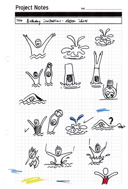
Based on this basic idea, I tried out a few different poses, and you can probably see which ones I liked and which I rejected. I rejected the diving and dive-bombing figures as soon as I drew them. The swimming figure went through a couple of versions before I decided I didn't like it.
There were some other details to get straight as well: how to draw the hands (I decided on no fingers), whether to include hair (no) and "speed lines" (no).
At this point I showed them to my wife. She pointed out that most of the guests would be girls so we should have a few swimming costumes: the figure on the bottom right is actually hers. Costumes meant colour, so I went back and added some colour to a few of the sketches. I didn't need to do much before I had a good idea of what I wanted.
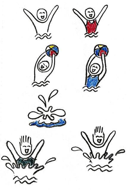
On to the final versions. I decided to do "girl" and "boy" versions of my three favourite figures, as well as the splash figure. I drew them on decent sketching paper using a charcoal pencil and, because by this point I had a very firm idea of what I wanted, I was happy with the first version of each one. The colour was added using some old wax oil crayons (Caran D'Ache Neocolour if you're interested) that we had hanging around. After that, it was just a case of scanning each individual figure, cleaning it up a little in Photoshop Elements (to get rid of the minute specks of charcoal that had been scattered across the paper while drawing), mirroring them to give a few variations, and importing them into the invitation itself.
So that's it. A pretty simple design job, and not a lot of artistic effort, but I was fascinated by how the design process itself helped to solidify my ideas and give myself the freedom to play with forms without making any commitments. Thanks Mike!

2 comments:
Hi Neal,
glad your still around, and that was a cool card you made, hope the party goes swimmingly ;-D
and happy birthday to your girls
Neal, really nice sketchwork there! It's always great to see someone benfitting from my experiences... I now officially have one design process disciple! :-)
Cheers and thanks for the mention!
Post a Comment