Just to move away from the usual topic for a while, you might like to head over to
Thomas Dolby’s Blog, where he has generously made available a track for download. This is a mash-up between a new song of his, and a Peter Gabriel song, and since Thomas Dolby and Peter Gabriel are among my favourite (musical) artists, I couldn't let the opportunity pass by without saying something. I had the pleasure of seeing Thomas Dolby live for the first time just a few weeks ago.
To my regular readers, I apologise for the lack of posting of late. I will try and get back to a more regular schedule, but life has been (and continues to be) hectic, hence the drop down to the more occasional, and sometimes off-topic, post. Bear with me, please, and do please keep reading!
Update 23 Aug: Sadly, Thomas has taken the track down. He didn't feel comfortable putting it up without Peter Gabriel's permission, which sounds fair enough to me.
Tuesday, August 22, 2006
Wednesday, July 19, 2006
o2 Wireless Festival
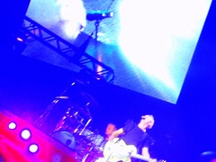
Slightly off-topic I know, but I've just uploaded a bunch of photographs to both Flickr and Picasa Web Albums that I took on my recent trip to see the o2 Wireless Festival at Hyde Park. If, like me, you're around about the 40 mark, and (despite, or perhaps because of, your excellent and eclectic taste in music) your heart is really in the 80s, you might be interested in taking a look.
On a more artistic note, I'm quite pleased with some of them, having fiddled with several of them to make up for the excessive zoom I had to use for many of them, and the blur caused by not being able to use a flash from a distance.
You can find the Flickr pics here, and you can find the Picasa Web album pics here.
Monday, July 10, 2006
Illustration Friday: Skyline

This week's Illustration Friday theme is "Skyline", so I thought I'd repost this picture that I originally published almost exactly a year ago. Sorry it's not new, but I thought it was a pretty good fit with this week's theme.
Tuesday, June 27, 2006
A trip to London, the NPG, and the BP Portrait Award
I took a trip to London this weekend to meet up with some old school friends and celebrate our 40th birthdays by going to the last day of the O2 Wireless Festival at Hyde Park.
Before meeting up with them, I had to take some time out to go to the National Portrait Gallery, which I love to do whenever I get the chance. As always, the visit was worthwhile. I think portraiture is one of my favourite "forms" of art. In terms of a painting's emotional impact on me, I think I get more from a portrait than from almost any other subject, much as I love all forms of art. People often mistake portraits as being about the subject, but this is only telling at most half of the story. For me, a portrait is at least as much about the artist as it is about the subject, often more so.
Although it's only about 3 months since my last visit to the NPG, a lot has changed there. In particular, most of the Ondaatje Wing is taken up by the BP Portrait Award 2006, which you can see thumbnails of by clicking the title of this post. I was blown away by this exhibition; the depth of work, the intensity that many of the pieces had, and the quality were quite stunning. Of course, the thumbnails do the exhibition no justice: with exhibits ranging from a few inches square to 6 feet or more in height, the range of pieces on display was enormous. I spent a happy hour looking at this exhibition, basking in the talent that was on display, feeling both inspired and inadequate at the same time.
If you're in London any time before 17th September, do yourself a favour and go and see this exhibition.
And for anyone interested, the Wireless Festival was great too. Treats for the eyes, ears, and heart all in the same day. (Though my feet weren't so happy. I hate my feet.)
Friday, June 23, 2006
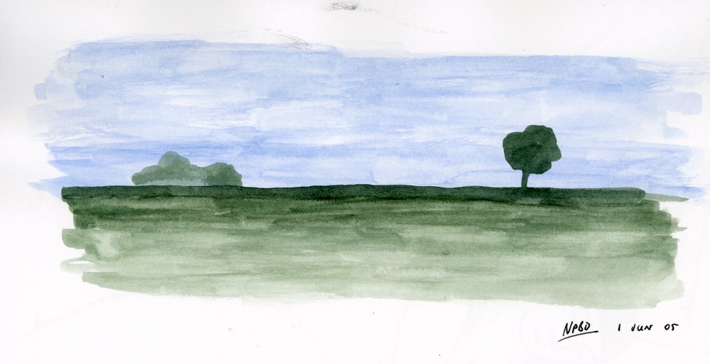
Scots Pine
 I had intended to post this as an entry for this week's theme at Illustration Friday, which I thought was "Jungle". Well, I must have been going mad, because it's "Dance" -- "Jungle" was some while back. I'd written the post, published it, and everything. It was only when I came to add the link at the website that I discovered my error. Hmm, what went wrong with my brain there, I wonder?
It's actually a tree in Cumbria, right outside the caravan that we stayed in a few weeks ago. A Scots Pine, to be exact. I painted it from inside the caravan on a lovely sunny, but cold, Spring afternoon. I've been looking for the excuse to post it, and here it is.
Friday, June 16, 2006
Flickr resolutions
Well, finally my Flickr account has been un-NIPSA'ed, so my public photos will now show up in searches in Flickr. It works: I've tried it.
I had a nice reply from the support group at Flickr. They still didn't actually tell me I no longer have a NIPSA on my account (what is their problem with that?), but they did at least answer my original points by assuring me that they are looking at a different site model which will allow different types of images, with the aim of eventually doing away with NIPSA altogether. We'll see.
I can't fault the support group in this instance. My query didn't drop into a black hole as I was worried it might. They answered my questions -- albeit with their hands tied due to a restrictive policy, and sorted my account. Was this because I blogged about the experience? Who knows. My site has certainly attracted a lot more traffic recently as a result.
I received my invite for Picasa web albums, by the way, and have been trying it out. Some more details soon.
Picasa web albums
Following Google's announcement that there's a beta version of Picasa that publishes to the web, I've managed to get myself an invite to test it out. My initial impressions are all pretty good. It's very easy to use, especially from Picasa itself, they give you a pretty generous 250MB to use for your photos (with a reasonably priced option to upgrade to a massive 6GB), and photos load very quickly, allowing smooth transitions between different photos when you're viewing. It all looks very pretty, if perhaps not quite as pretty as Flickr.
There are a few things that are missing. You can't add "post-it" type notes to pictures like you can with Flickr. While captions are uploaded from Picasa, tags are not. They have a "favourite users" feature, but it's not easy to find other users unless they share the URLs of their public gallery. Also, most tragically of all given that this is a Google product, you can't yet search across the whole of Picasa web albums for something. This is in stark contrast to Flickr, and I can't believe they're not going to address that.
But, for a beta product, it's already very stable and usable. Which, to be fair, has been my experience with most beta products from Google.
In the meantime, you can view my public gallery here. There's not much there at the moment, but I hope to change that reasonably soon.
Wednesday, June 14, 2006
Creative Commons License
I've decided to apply a little licensing to the stuff I publish on this blog. Nothing heavy, nothing that will change what you can do with this stuff (in fact, it may encourage you to do more), just enough to make sure nobody takes any of my images and does something that I don't approve of.
To that end, everything published on this blog is now covered by the Creative Commons Attribution-NonCommercial-ShareAlike 2.5 License.
What does this mean? Simple. You can take any of these images and use them however you like. Take copies, publish them on your own website, even include them in your own works -- go on, mash 'em up, I encourage you. So long as:
- You make it perfectly clear that I am the original artist of any images you use
- You don't make any money out of what you do
- You license any derivative works of your own using the same Creative Commons license.
Flickr fixes?
Well, maybe "alternatives" is more appropriate than "fixes", because with my Flickr account still NIPSA'ed, I greeted the news that Picasa is soon to support publishing web albums with enthusiasm. I'm a big fan of Picasa (no other web album software, either free or paid for, comes close in my opinion), and have been using it for quite a while now. The new functionality is still by invitation from Google only, but I signed up for an invite. Fingers crossed that one will be dropped in my mailbox soon!
Wednesday, June 07, 2006
Flickr Frustrations
You may have noticed the new widget on the right hand side of the page: a little moving mosaic of pictures. This is a toy from the Flickr website that lets me display a random selection of pictures that I've uploaded to my Flickr account, for your viewing pleasure. Just click on one of the pictures and you'll be taken to that picture in Flickr.
For those that don't know, Flickr is a photo-sharing website, allowing you to upload your own photos, and explore those that have been uploaded by others. You can tag your photos according to subject, and search the whole of Flickr for photos based on the tags that other people have applied. As well as making photos available in several sizes, you can add descriptions, captions and, most fun, "post-it" style notes to individual pictures. I've had a Flickr account for about 18 months now. There are free and paid-for versions, and I opted for the free version.
Until recently, I haven't made a lot of use of Flickr. When I first joined, I only uploaded a few pictures. To be honest, cool as it was, I just wasn't that taken with it. I wasn't particularly impressed by the interface, and I didn't think that I was going to make a lot of use of the additional features it offered beyond a service like Blogger. It was great for finding photos, but for uploading my own, I could take it or leave it.
Skip 18 months, and quite a lot has changed at Flickr. They were bought by Yahoo (which you may or may not view as a good thing), and a lot of improvements have been made to the interface to let you organize and upload your photos better. I liked the new interface much better, so I started to use it more. And here began the problems.
I noticed pretty quickly that the photos that I was uploading weren't searchable by anyone else. If I searched my own photos, I could find stuff based on the tags I knew I'd applied, but if I tried searching the pool of everyone's photos, mine didn't show up. Thinking that my account was still "pending" because I hadn't uploaded enough photos, I uploaded some more. Still no joy. Having searched the forums and the online help, I threw in the towel and contacted Flickr support. Hats off to them: they answered my query within 12 hours, identified the problem correctly, and gave me a solution. Unfortunately, the answer wasn't particularly encouraging.
My account wasn't "pending", it was "NIPSA", which stands for "Not Included In Public Search Areas". In other words, what I was uploading was marked as unsuitable for general viewing. Why? Because some of the pictures I'd uploaded were not photos, they were pictures. You know: the kind of pictures I upload to this very blog all the time. And this decision had been made without even the courtesy of informing me. If I wanted the "NIPSA" label to be removed from my account, I had to set permissions on the offending non-photos so that they were only viewable by friends and family, or I had to mark them as "potentially offensive". Excuse me? Hands up the first person who has ever, I repeat, ever, found anything genuinely offensive in any of my pictures?!
So, a picture of one of my daughters is to be considered potentially offensive by the powers that be at Yahoo? Well, excuse me buddy, but I'm potentially offended by that idea. I can understand that Flickr is a photo site, and I can understand that they are very keen to avoid copyrighted works being published there, but there has to be a better way to do it than by employing this sledgehammer policy.
So what should I do? My immediate reaction was to stop using Flickr altogether, but then I decided that was cutting off my nose to spite my face. If all I want to do is upload photos, then there's no doubt that Flickr is a whole lot easier than Blogger, and gives you a lot more functionality.
I could just remove all the non-photos from Flickr. After all, I post them all here, so what's to be gained? Well, at the moment, very little, but you could potentially visit Flick to download larger versions of the pictures, if you so wished. I could also use their cool "post-it note" functionality to add notes to specific areas of pictures, for those of you that were interested in the more technical, geeky aspects of what I upload.
I could mark them as visible only by family and friends, and then require that all readers of this blog ask me to be added as one of my friends. Which, for all I know, may require you to sign up to use Flickr yourselves. That sounds a bit steep to me, and a bit of an administrative chore for me.
Or I could (and this is what I've chosen to do for the time being) just mark my non-photos as being "potentially offensive". But sorry, as a long term solution, that just sticks in my craw. My pictures are about as offensive as guinea pigs, and I object to them being lumped together with porn.
To be honest, I'm erring towards the option of removing the non-photos. There aren't that many anyway. But I'm interested in hearing your thoughts. I'm also interested in finding out exactly what you can see by clicking on a picture in that little widget on the right as things currently stand: do you just see photos, or do you see my pictures as well? Please let me know via the comments button!
Currently, my account still seems to be "NIPSA". I've no idea how long it will take to be reviewed, but I await the change with baited breath.
Tuesday, June 06, 2006
Illustration Friday: Portrait
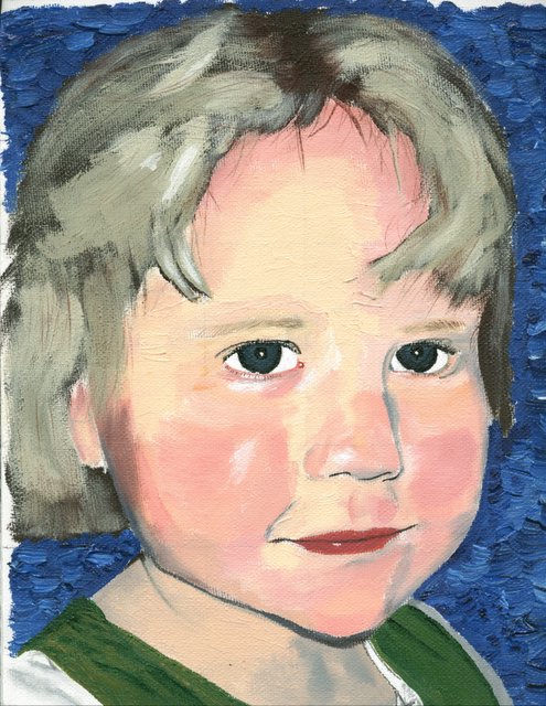 This week's theme at Illustration Friday is simply "portrait". So here's one that's quite old, though I don't think I've ever posted it.
This is my youngest daughter, taken from a photo of her at the age of four. It's painted in acrylic on canvas paper. I've always liked this painting, because it was the first piece I ever attempted in acrylic, and only the second portrait I had done. I really had very little idea what I was doing (like I have any idea now, when I start a piece!), but I liked the end result.

Friday, May 26, 2006
Illustration Friday: Sorry
 This week's topic (just -- it ends today) is "sorry". So, to my few loyal regulars: I am sorry that I haven't posted in such a long time, and I'm sorry that this particular post is nothing to shout about. I just haven't had much chance for sketching or painting lately, and I have always felt strongly that if you have nothing worth posting on your blog, then it's better not to post!
So anyway, this was just a strange idea that I had which didn't work out as well as I'd hoped. I may have another crack at it.
Tomorrow, we're off to Cumbria for a few days, so I hope to be inspired by the scenery. Mind you, given the weather for the last few weeks, I may be drawing clouds and rain!
Wednesday, March 22, 2006

Wednesday, March 15, 2006
The sleeping lady
For a long time now I've wanted to write a longer article that went into more detail about how I created a specific piece: what enthused me about the piece, the different stages I went through to get to the final result, how I chose colours, media, and so on. Just before Christmas, the opportunity presented itself when I worked on a number of pieces based on the idea of a sleeping lady. I posted the first of these as soon as it was finished, but, as I suspected at the time, it ended up being just the first in a series, each of which built upon the last until I ended up with the piece that I'd had in mind to begin with.
The original inspiration for this piece came from the artist Anita Klein . I was walking to work early one morning and passed a gallery that included one of her pieces in the window. I was immediately struck by the deceptive simplicity of her work. Beautiful colours, incredibly assured brush strokes, bold shapes. I knew that I wanted to try something similar to this, and the idea for the sleeping lady sprang immediately into my mind.
One of the things that I love about sketching and painting are the times when that happens: a picture just leaps into your mind. Usually, it's inspired by some event, no matter how small. Something you've seen, usually, or perhaps a photograph you've taken, but it can sometimes be something you've heard, or something you've discussed. But no matter what it is that's inspired you, I find it amazing that an almost complete picture can form in your mind from just the grain of an idea. The challenge then becomes to transfer what is in your head onto the paper -- and there is the real challenge! If you can get within 90% of your original idea, then I think you're doing well, always assuming that your original idea doesn't change along the way of course!
With the sleeping lady, I saw this woman (who is she? I still have no idea), asleep, presented using simple, almost cartoon-like lines. The background needed to be unidentifiable, and possibly even ambiguous. Her location was totally unimportant to the piece other than as a way of framing her: is she on a bed or on the ground? Inside or outside? That's up to you. They key to this piece was going to be the colours. I wanted very bold, brave colours, and if they weren't right, then the whole piece would have failed.
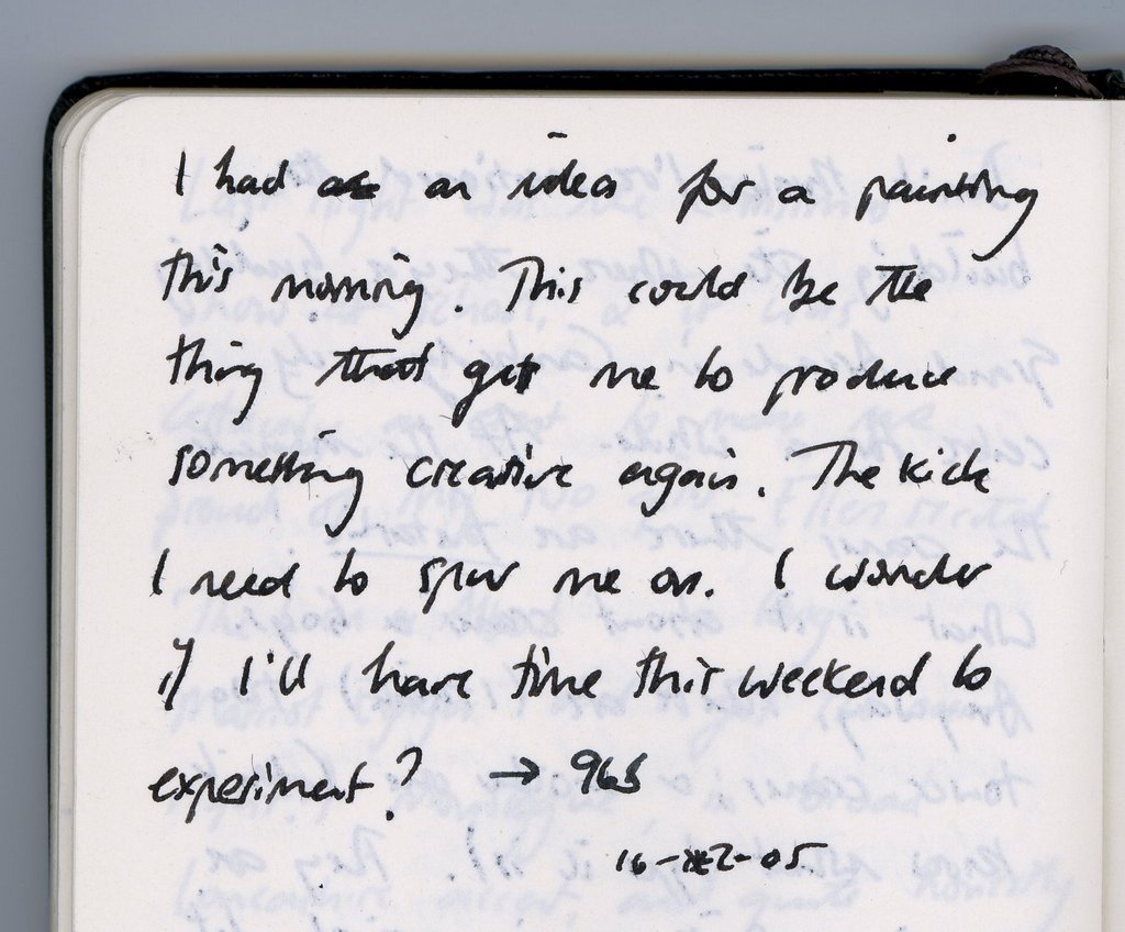
 So there it was: the grain of an idea, taken root while walking to work. The first thing I did was write it down in my Moleskine. If an idea is worth a grain of salt, I need to write it down. This isn't just a memory thing: writing it down is almost like a proof of concept. If I can write the idea down, come back to it at a later time, and decide it's still a good idea, then it's probably worth doing. Some of my favourite pieces (other than sketches that have just been done on the spur of the moment) have started with entries in my journal. You'll notice that I didn't include any details at all in my journal; just a record of having had the idea was enough on this occasion.
The first sleeping lady was the pencil sketch I've already posted. Funnily enough, the basic shapes for this version came very easily, and changed little during the various phases of this project. I sketched the rough shape of the lady using a B grade pencil, put in a little background detail, and then went over the outline in more detail using a dark sketching pencil. At this point, I thought to scan what I had, even though I intended on adding colour. I knew that the colours I chose were going to be essential to this piece, so I wanted to be able to produce several versions easily so that I could experiment later on.
Next, I needed to add a little colour.I knew I wanted a bright red, and a rich, turquoisey blue. I thought orange would be a good contrast to the blue as well. And what to lie on? A dark green was as good as anything; funnily enough it was this dark green that ended up changing the least. Having chosen four colours, I went on to colour the original sketch. I used standard colouring pencils, partly because it was quick and I knew I'd need to experiment with the colours, and partly because I just wanted to try using some colouring pencils -- something I hadn't used since I was a kid. Hey, this was just like a colouring book!
 I was pleased with the result -- pleased enough to post it to Mr. Porkpop -- but I knew that this was just the first stage in getting the colours right. The first task was to identify the range of colours that was best, and where they worked best in the image. The next day I printed out two copies of my original scan and coloured them in using different schemes.
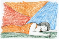
Now these were very rough, and at the time I never intended to post them; I'm only including them here to show what an important stage in the process it was. One of the sketches -- the one with the orange dress -- seemed obviously "wrong" to me. Repeating the orange in the background just didn't work. The other introduced an important new concept: another colour! I'd added a yellow background just to break up the image a little after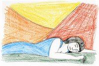 the "orange dress" sketch looked so wrong, and in doing that, the obvious jumped out at me. I had five regions in the image, so I needed five colours. But this second rough version worked in another way: the blue dress. I had always felt that blue was going to be the pivotal colour in this image (although at this stage, I hadn't even come close to producing on paper the blue that was in my head), and so to make the woman's dress blue seemed like the obvious thing. I knew then that I had my colour scheme.
At this point I put the piece to the back of my mind for a few days to enjoy the Christmas break. I knew that I wasn't finished with the sleeping lady, and I was becoming more and more convinced that her final "form" would be as an acrylic painting, but I knew I wasn't ready to dive straight into the final version, and I didn't know yet what the next stage was going to be. A change can be as good as a rest: after a few days I knew that I need to do a test piece in watercolour.
 I had a number of reasons for wanting to do another test piece. Firstly, I wanted to try something on a larger scale: all the sketches so far had been small, on A5 paper, so I wanted to try something on A3. Secondly, because the previous sketches had been coloured with pencil, they had been fine for getting the colours approximately right, but I wanted to continue to experiment with them. Lastly, it was really a case of elimination: I thought that my final piece would be an acrylic, and if I tried a watercolour first and still wanted to continue, I could be certain.
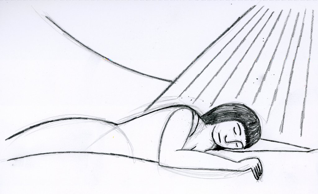
To recreate the sleeping lady for the watercolour, I sketched her from scratch on A3 cartridge paper. When it comes to reproducing images several times, I use a variety of techniques, and tend to go with my mood on the day. Sometimes I'll scan the original picture, overlay a grid on a print-out of the scan, and then reproduce the contents of each grid square for the new image. Other times, I'll trace over the original image. Often, I'll just draw the image again from scratch. For this picture I opted for the last of these methods because I wanted to retain a certain spontaneity in the piece, and I was confident that it was an image I could reproduce fairly well.
The watercolour also gave me a chance to practice the heavy black outlines I wanted to use on the piece. For these, I used undiluted black paint to achieve a heavy look. It worked well, better than I had expected, to be honest, but there was a certain spontaneity missing that I wanted. The outlines in the watercolour seemed to contrived, somehow, and one of the things I had admired about the original Anita Klein was the natural, almost carefree approach of the outlines in her piece.
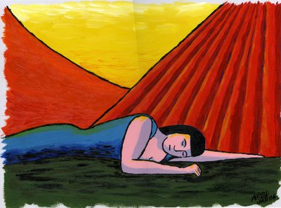
And so to the final piece. At the very beginning, I knew this would be an acrylic, rich in colour and texture. So far, nothing I had created had changed my mind about this; each version of the sleeping lady had been a way of getting to know her better. The original sketch had settled her form very well, and the subsequent pencilled versions had helped confirm the colours that I wanted. The watercolour had let me practice creating a "real" painting of her, and had given me the chance to experiment with texture and shading, so that I had a good idea of what I wanted in the final piece.
The sleeping lady is painted on A3 acrylic board with a canvas texture on the top. I love this particular type of support: it's light, firm to work on, and very durable. You don't have to place it on an easel to work with it (I have still not made up my mind whether I prefer working on an easel or not), and it's reasonably cheap as well. It's great for acrylics, and I presume for oils as well, though I have never painted with oils.
First of all, I sketched the sleeping lady for a third and last time, directly onto the board. You'd think I'd be pretty familiar with her by now, but funnily enough this was the hardest part of the acrylic, and it took three or four attempts before I was satisfied with the result. I put this down to the difference between trying to achieve a particular thing, and happy circumstance. With the original pencil sketches, I arrived at the final shapes easily, more by luck than design. It had been those original sketches that had confirmed what I wanted. When I drew the sketch for the watercolour, I knew that it wasn't my final piece, and so I suppose I was less fussy. By the time I got to the acrylic, I had a very fixed idea of what I wanted, and getting it proved to be less easy!
One of the things I love about acrylic painting is that you have to work so quickly; it is a totally absorbing medium to work in because once you start, you can't just put it aside. Unlike watercolour, where you can reinvigorate a colour with some water even when dry, once an acrylic is dry, you can do nothing other than paint over it. For this reason, I tend to divide acrylic paintings into sections in my mind, ensuring that I can complete each section successfully before moving onto the next. This allows me a number of stopping points in my work, should I need to do something else. Planning the painting in this way means that I won't have to leave it in a state that I might later regret.
For the sleeping lady, the painting divided naturally into six sections: the sky, the hill, the curtains, the lady herself, and the ground. The last section, not really an area of the painting, was to put in the outlines.
The rule of thumb, at least for me, is to start with the lightest, and the topmost. In this case, it so happened that the painting started off light at the top and got darker towards the bottom, so my approach was clear. I started with the yellow sky first, laying down a thick base layer of yellow and then working in white at the top and orange at the bottom before the yellow had dried.
The hill was next, and this was fairly similar to the sky. Lay down some orange, and blend in a little red towards the bottom.
The curtains were trickier. I had marked each fold in the pencil sketch, and so I started off by filling in the gaps between the folds with the lighter red colour. I then mixed in the darker colour and painted over the folds; by this time the lighter red was beginning to dry, which is why the boundary between the dark and the light is better defined in some areas and more mixed in others: an effect that happened by chance but which I liked in the final result. Once the curtains were completely dry, I carefully overpainted some highlights in yellow, and darkened some of the folds by painting faint blue lines.
Next came the lady herself, which I suppose was really two sections in itself: the skin and the dress. The skin divided neatly into shaded and unshaded areas, and I didn't want to blend the two, so painting them was straightforward: I mixed two shades of pink, one using some grey and blue, and painted the relevant areas. After starting, I worried briefly over whether I had the shading correct. I suspect it's not natural around her neck, but I quickly decided not to worry about it, and just to go with my instinct.
For the dress, I had to get exactly the right shade of blue. I'd had this shade in my head since the very start, and I was a little worried that I wouldn't be able to reproduce it on the page. As it happened, I needn't have worried, since I mixed the right shade almost straight away. I combined this with a darker blue and a bit of yellow to suggest shading and highlights in the dress. I'm still not sure about the yellow highlights -- I added a few to her skin as well -- and they're the part of the finished painting that I'm least pleased with, but the effects are pretty muted, so probably not worth worrying about.
The ground was easy. Some very dark green, overpainted with some brown strokes.
Lastly, I needed to add black to the picture. I was pretty nervous about doing this, because one mistake could have ruined the picture, and yet I wanted to capture a roughness in the outlines that I hadn't achieved in the earlier paintings, and painting too carefully wouldn't have allowed me to do this. The use of black really went back to my earlier admiration of Anita Klein's work: natural, almost carefree outlines, using a paint brush to capture shape as a child does, rather than to paint. Well, I didn't achieve that, but I was pleased with what I did achieve: shorter brush strokes to give a thicker, blockier effect. Lastly, I darkened the shading under her dress and on the ground fairly crudely using black -- another trick I had picked up from Anita Klein -- and I was done.
I hope you like the end result; I do. I still have no idea who the sleeping lady is, but whatever her identity, I hope she's having sweet dreams!
The original inspiration for this piece came from the artist Anita Klein . I was walking to work early one morning and passed a gallery that included one of her pieces in the window. I was immediately struck by the deceptive simplicity of her work. Beautiful colours, incredibly assured brush strokes, bold shapes. I knew that I wanted to try something similar to this, and the idea for the sleeping lady sprang immediately into my mind.
One of the things that I love about sketching and painting are the times when that happens: a picture just leaps into your mind. Usually, it's inspired by some event, no matter how small. Something you've seen, usually, or perhaps a photograph you've taken, but it can sometimes be something you've heard, or something you've discussed. But no matter what it is that's inspired you, I find it amazing that an almost complete picture can form in your mind from just the grain of an idea. The challenge then becomes to transfer what is in your head onto the paper -- and there is the real challenge! If you can get within 90% of your original idea, then I think you're doing well, always assuming that your original idea doesn't change along the way of course!
With the sleeping lady, I saw this woman (who is she? I still have no idea), asleep, presented using simple, almost cartoon-like lines. The background needed to be unidentifiable, and possibly even ambiguous. Her location was totally unimportant to the piece other than as a way of framing her: is she on a bed or on the ground? Inside or outside? That's up to you. They key to this piece was going to be the colours. I wanted very bold, brave colours, and if they weren't right, then the whole piece would have failed.
 So there it was: the grain of an idea, taken root while walking to work. The first thing I did was write it down in my Moleskine. If an idea is worth a grain of salt, I need to write it down. This isn't just a memory thing: writing it down is almost like a proof of concept. If I can write the idea down, come back to it at a later time, and decide it's still a good idea, then it's probably worth doing. Some of my favourite pieces (other than sketches that have just been done on the spur of the moment) have started with entries in my journal. You'll notice that I didn't include any details at all in my journal; just a record of having had the idea was enough on this occasion.
The first sleeping lady was the pencil sketch I've already posted. Funnily enough, the basic
 shapes for this version came very easily, and changed little during the various phases of this project. I sketched the rough shape of the lady using a B grade pencil, put in a little background detail, and then went over the outline in more detail using a dark sketching pencil. At this point, I thought to scan what I had, even though I intended on adding colour. I knew that the colours I chose were going to be essential to this piece, so I wanted to be able to produce several versions easily so that I could experiment later on.
Next, I needed to add a little colour.I knew I wanted a bright red, and a rich, turquoisey blue. I thought orange would be a good contrast to the blue as well. And what to lie on? A dark green was as good as anything; funnily enough it was this dark green that ended up changing the least. Having chosen four colours, I went on to colour the original sketch. I used standard colouring pencils, partly because it was quick and I knew I'd need to experiment with the colours, and partly because I just wanted to try using some colouring pencils -- something I hadn't used since I was a kid. Hey, this was just like a colouring book!
 I was pleased with the result -- pleased enough to post it to Mr. Porkpop -- but I knew that this was just the first stage in getting the colours right. The first task was to identify the range of colours that was best, and where they worked best in the image. The next day I printed out two copies of my original scan and coloured them in using different schemes.
Now these were very rough, and at the time I never intended to post them; I'm only including them here to show what an important stage in the process it was. One of the sketches -- the one with the orange dress -- seemed obviously "wrong" to me. Repeating the orange in the background just didn't work. The other introduced an important new concept: another colour! I'd added a yellow background just to break up the image a little after
 the "orange dress" sketch looked so wrong, and in doing that, the obvious jumped out at me. I had five regions in the image, so I needed five colours. But this second rough version worked in another way: the blue dress. I had always felt that blue was going to be the pivotal colour in this image (although at this stage, I hadn't even come close to producing on paper the blue that was in my head), and so to make the woman's dress blue seemed like the obvious thing. I knew then that I had my colour scheme.
At this point I put the piece to the back of my mind for a few days to enjoy the Christmas break. I knew that I wasn't finished with the sleeping lady, and I was becoming more and more convinced that her final "form" would be as an acrylic painting, but I knew I wasn't ready to dive straight into the final version, and I didn't know yet what the next stage was going to be. A change can be as good as a rest: after a few days I knew that I need to do a test piece in watercolour.
 I had a number of reasons for wanting to do another test piece. Firstly, I wanted to try something on a larger scale: all the sketches so far had been small, on A5 paper, so I wanted to try something on A3. Secondly, because the previous sketches had been coloured with pencil, they had been fine for getting the colours approximately right, but I wanted to continue to experiment with them. Lastly, it was really a case of elimination: I thought that my final piece would be an acrylic, and if I tried a watercolour first and still wanted to continue, I could be certain.
To recreate the sleeping lady for the watercolour, I sketched her from scratch on A3 cartridge paper. When it comes to reproducing images several times, I use a variety of techniques, and tend to go with my mood on the day. Sometimes I'll scan the original picture, overlay a grid on a print-out of the scan, and then reproduce the contents of each grid square for the new image. Other times, I'll trace over the original image. Often, I'll just draw the image again from scratch. For this picture I opted for the last of these methods because I wanted to retain a certain spontaneity in the piece, and I was confident that it was an image I could reproduce fairly well.
The watercolour also gave me a chance to practice the heavy black outlines I wanted to use on the piece. For these, I used undiluted black paint to achieve a heavy look. It worked well, better than I had expected, to be honest, but there was a certain spontaneity missing that I wanted. The outlines in the watercolour seemed to contrived, somehow, and one of the things I had admired about the original Anita Klein was the natural, almost carefree approach of the outlines in her piece.
And so to the final piece. At the very beginning, I knew this would be an acrylic, rich in colour and texture. So far, nothing I had created had changed my mind about this; each version of the sleeping lady had been a way of getting to know her better. The original sketch had settled her form very well, and the subsequent pencilled versions had helped confirm the colours that I wanted. The watercolour had let me practice creating a "real" painting of her, and had given me the chance to experiment with texture and shading, so that I had a good idea of what I wanted in the final piece.
The sleeping lady is painted on A3 acrylic board with a canvas texture on the top. I love this particular type of support: it's light, firm to work on, and very durable. You don't have to place it on an easel to work with it (I have still not made up my mind whether I prefer working on an easel or not), and it's reasonably cheap as well. It's great for acrylics, and I presume for oils as well, though I have never painted with oils.
First of all, I sketched the sleeping lady for a third and last time, directly onto the board. You'd think I'd be pretty familiar with her by now, but funnily enough this was the hardest part of the acrylic, and it took three or four attempts before I was satisfied with the result. I put this down to the difference between trying to achieve a particular thing, and happy circumstance. With the original pencil sketches, I arrived at the final shapes easily, more by luck than design. It had been those original sketches that had confirmed what I wanted. When I drew the sketch for the watercolour, I knew that it wasn't my final piece, and so I suppose I was less fussy. By the time I got to the acrylic, I had a very fixed idea of what I wanted, and getting it proved to be less easy!
One of the things I love about acrylic painting is that you have to work so quickly; it is a totally absorbing medium to work in because once you start, you can't just put it aside. Unlike watercolour, where you can reinvigorate a colour with some water even when dry, once an acrylic is dry, you can do nothing other than paint over it. For this reason, I tend to divide acrylic paintings into sections in my mind, ensuring that I can complete each section successfully before moving onto the next. This allows me a number of stopping points in my work, should I need to do something else. Planning the painting in this way means that I won't have to leave it in a state that I might later regret.
For the sleeping lady, the painting divided naturally into six sections: the sky, the hill, the curtains, the lady herself, and the ground. The last section, not really an area of the painting, was to put in the outlines.
The rule of thumb, at least for me, is to start with the lightest, and the topmost. In this case, it so happened that the painting started off light at the top and got darker towards the bottom, so my approach was clear. I started with the yellow sky first, laying down a thick base layer of yellow and then working in white at the top and orange at the bottom before the yellow had dried.
The hill was next, and this was fairly similar to the sky. Lay down some orange, and blend in a little red towards the bottom.
The curtains were trickier. I had marked each fold in the pencil sketch, and so I started off by filling in the gaps between the folds with the lighter red colour. I then mixed in the darker colour and painted over the folds; by this time the lighter red was beginning to dry, which is why the boundary between the dark and the light is better defined in some areas and more mixed in others: an effect that happened by chance but which I liked in the final result. Once the curtains were completely dry, I carefully overpainted some highlights in yellow, and darkened some of the folds by painting faint blue lines.
Next came the lady herself, which I suppose was really two sections in itself: the skin and the dress. The skin divided neatly into shaded and unshaded areas, and I didn't want to blend the two, so painting them was straightforward: I mixed two shades of pink, one using some grey and blue, and painted the relevant areas. After starting, I worried briefly over whether I had the shading correct. I suspect it's not natural around her neck, but I quickly decided not to worry about it, and just to go with my instinct.
For the dress, I had to get exactly the right shade of blue. I'd had this shade in my head since the very start, and I was a little worried that I wouldn't be able to reproduce it on the page. As it happened, I needn't have worried, since I mixed the right shade almost straight away. I combined this with a darker blue and a bit of yellow to suggest shading and highlights in the dress. I'm still not sure about the yellow highlights -- I added a few to her skin as well -- and they're the part of the finished painting that I'm least pleased with, but the effects are pretty muted, so probably not worth worrying about.
The ground was easy. Some very dark green, overpainted with some brown strokes.
Lastly, I needed to add black to the picture. I was pretty nervous about doing this, because one mistake could have ruined the picture, and yet I wanted to capture a roughness in the outlines that I hadn't achieved in the earlier paintings, and painting too carefully wouldn't have allowed me to do this. The use of black really went back to my earlier admiration of Anita Klein's work: natural, almost carefree outlines, using a paint brush to capture shape as a child does, rather than to paint. Well, I didn't achieve that, but I was pleased with what I did achieve: shorter brush strokes to give a thicker, blockier effect. Lastly, I darkened the shading under her dress and on the ground fairly crudely using black -- another trick I had picked up from Anita Klein -- and I was done.
I hope you like the end result; I do. I still have no idea who the sleeping lady is, but whatever her identity, I hope she's having sweet dreams!
Friday, March 10, 2006
Concentrating on a Gameboy
 On the train after a trip to London to see the Science Museum. My youngest daughter slumps on the seat opposite me, tired, footsore, and so wrapped up in layers of clothing that they seem to swamp her (it's been a cold day). Clothing isn't the only thing she's wrapped up in, because she's playing on her Gameboy, unaware that I'm sketching her. She looks as if she's asleep, but actually she's on Level 4.
Mr. Porkpop is a year old today: it's a year since I wrote this post. Sorry Brenda, no time to draw you a cake, but hopefully I'll be able to post something more interesting in the next few days. Did I think I'd still be here, posting sketches, in a year's time? I hoped I would be, but I had no idea.
Tuesday, February 28, 2006
Glashaus [The Portfolio of Peter Hoffmann]
Have just discovered the Glashaus [The Portfolio of Peter Hoffmann]
website. Peter Hoffman is a freelance illustrator and designer, and he has some lovely sketches on this site, as well as some pretty cool design work.
website. Peter Hoffman is a freelance illustrator and designer, and he has some lovely sketches on this site, as well as some pretty cool design work.
Monday, February 27, 2006
Illustration Friday: Tea

Along much of its length as it runs through Teesdale, the River Tees is the colour of tea, and that's not intended as a pun. A beautiful rich brown colour, and crystal clear, I'm not exactly sure why the water is this colour, but I presume it's to do with the minerals that are naturally found in the ground over which the river runs. Somehow, to find out the secret would be to lose some of the mystery of the place. This is a pastel sketch of the Tees at High Force, one of England's biggest waterfalls. Watching the rich brown water crashing down its 70 foot height, hearing the roar of the water, is quite an inspiring sight.
Thursday, February 16, 2006
Illustration Friday: Simple
A rather late entry to Illustration Friday this week! This week's theme is "Simple", and this is a watercolour I created while on a holiday in Cumbria last year. I wanted to see how quickly and simply I could create a landscape with just a minimum of colours. If I recall correctly, the answer was about two minutes.
Monday, February 06, 2006
Illustration Friday: Chair
 This week's theme for Illustration Friday is "Chair". Here's a sketch of a garden chair that I drew one sunny summer's afternoon nearly three years ago. I've never posted it before because it's not one of my favourites: I drew it not long after I started up sketching again, and the proportions are all wrong -- not enough width. But when I saw this week's theme I though "ah well, in for a penny, in for a pound", so here we are: chair.
Monday, January 16, 2006
Illustration Friday: E is for ...

I don't often post pictures more than once, but this week's Illustration Friday theme is "E is for ...", so I had to enter this one.
In my case, E is for Ellen, my ten-year-old.
Thursday, January 12, 2006
moleskinerie

Happy birthday to Moleskinerie, two today. A fine site for all lovers of Moleskine, which has been kind enough to send me a few visitors in the past.
Although dedicated to all things Moleskine, it is not just about Moleskines, and you can be guaranteed to find something interesting just by looking at the home page.
Happy birthday Armando! I wish Moleskinerie a long and prosperous life.
Illustration Friday
Hello to anyone visitng from the Illustration Friday website. I submitted my parasol picture for this week's sea theme, and my site stats have gone through the roof. So thanks to all of you for taking the time to visit. I hope a few of you will come back :-)
Subscribe to:
Posts (Atom)
