
Wednesday, March 22, 2006
Wednesday, March 15, 2006
The sleeping lady
For a long time now I've wanted to write a longer article that went into more detail about how I created a specific piece: what enthused me about the piece, the different stages I went through to get to the final result, how I chose colours, media, and so on. Just before Christmas, the opportunity presented itself when I worked on a number of pieces based on the idea of a sleeping lady. I posted the first of these as soon as it was finished, but, as I suspected at the time, it ended up being just the first in a series, each of which built upon the last until I ended up with the piece that I'd had in mind to begin with.
The original inspiration for this piece came from the artist Anita Klein . I was walking to work early one morning and passed a gallery that included one of her pieces in the window. I was immediately struck by the deceptive simplicity of her work. Beautiful colours, incredibly assured brush strokes, bold shapes. I knew that I wanted to try something similar to this, and the idea for the sleeping lady sprang immediately into my mind.
One of the things that I love about sketching and painting are the times when that happens: a picture just leaps into your mind. Usually, it's inspired by some event, no matter how small. Something you've seen, usually, or perhaps a photograph you've taken, but it can sometimes be something you've heard, or something you've discussed. But no matter what it is that's inspired you, I find it amazing that an almost complete picture can form in your mind from just the grain of an idea. The challenge then becomes to transfer what is in your head onto the paper -- and there is the real challenge! If you can get within 90% of your original idea, then I think you're doing well, always assuming that your original idea doesn't change along the way of course!
With the sleeping lady, I saw this woman (who is she? I still have no idea), asleep, presented using simple, almost cartoon-like lines. The background needed to be unidentifiable, and possibly even ambiguous. Her location was totally unimportant to the piece other than as a way of framing her: is she on a bed or on the ground? Inside or outside? That's up to you. They key to this piece was going to be the colours. I wanted very bold, brave colours, and if they weren't right, then the whole piece would have failed.
 So there it was: the grain of an idea, taken root while walking to work. The first thing I did was write it down in my Moleskine. If an idea is worth a grain of salt, I need to write it down. This isn't just a memory thing: writing it down is almost like a proof of concept. If I can write the idea down, come back to it at a later time, and decide it's still a good idea, then it's probably worth doing. Some of my favourite pieces (other than sketches that have just been done on the spur of the moment) have started with entries in my journal. You'll notice that I didn't include any details at all in my journal; just a record of having had the idea was enough on this occasion.
The first sleeping lady was the pencil sketch I've already posted. Funnily enough, the basic shapes for this version came very easily, and changed little during the various phases of this project. I sketched the rough shape of the lady using a B grade pencil, put in a little background detail, and then went over the outline in more detail using a dark sketching pencil. At this point, I thought to scan what I had, even though I intended on adding colour. I knew that the colours I chose were going to be essential to this piece, so I wanted to be able to produce several versions easily so that I could experiment later on.
Next, I needed to add a little colour.I knew I wanted a bright red, and a rich, turquoisey blue. I thought orange would be a good contrast to the blue as well. And what to lie on? A dark green was as good as anything; funnily enough it was this dark green that ended up changing the least. Having chosen four colours, I went on to colour the original sketch. I used standard colouring pencils, partly because it was quick and I knew I'd need to experiment with the colours, and partly because I just wanted to try using some colouring pencils -- something I hadn't used since I was a kid. Hey, this was just like a colouring book!
 I was pleased with the result -- pleased enough to post it to Mr. Porkpop -- but I knew that this was just the first stage in getting the colours right. The first task was to identify the range of colours that was best, and where they worked best in the image. The next day I printed out two copies of my original scan and coloured them in using different schemes.
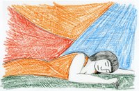
Now these were very rough, and at the time I never intended to post them; I'm only including them here to show what an important stage in the process it was. One of the sketches -- the one with the orange dress -- seemed obviously "wrong" to me. Repeating the orange in the background just didn't work. The other introduced an important new concept: another colour! I'd added a yellow background just to break up the image a little after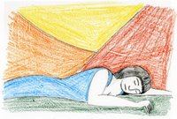 the "orange dress" sketch looked so wrong, and in doing that, the obvious jumped out at me. I had five regions in the image, so I needed five colours. But this second rough version worked in another way: the blue dress. I had always felt that blue was going to be the pivotal colour in this image (although at this stage, I hadn't even come close to producing on paper the blue that was in my head), and so to make the woman's dress blue seemed like the obvious thing. I knew then that I had my colour scheme.
At this point I put the piece to the back of my mind for a few days to enjoy the Christmas break. I knew that I wasn't finished with the sleeping lady, and I was becoming more and more convinced that her final "form" would be as an acrylic painting, but I knew I wasn't ready to dive straight into the final version, and I didn't know yet what the next stage was going to be. A change can be as good as a rest: after a few days I knew that I need to do a test piece in watercolour.
 I had a number of reasons for wanting to do another test piece. Firstly, I wanted to try something on a larger scale: all the sketches so far had been small, on A5 paper, so I wanted to try something on A3. Secondly, because the previous sketches had been coloured with pencil, they had been fine for getting the colours approximately right, but I wanted to continue to experiment with them. Lastly, it was really a case of elimination: I thought that my final piece would be an acrylic, and if I tried a watercolour first and still wanted to continue, I could be certain.
To recreate the sleeping lady for the watercolour, I sketched her from scratch on A3 cartridge paper. When it comes to reproducing images several times, I use a variety of techniques, and tend to go with my mood on the day. Sometimes I'll scan the original picture, overlay a grid on a print-out of the scan, and then reproduce the contents of each grid square for the new image. Other times, I'll trace over the original image. Often, I'll just draw the image again from scratch. For this picture I opted for the last of these methods because I wanted to retain a certain spontaneity in the piece, and I was confident that it was an image I could reproduce fairly well.
The watercolour also gave me a chance to practice the heavy black outlines I wanted to use on the piece. For these, I used undiluted black paint to achieve a heavy look. It worked well, better than I had expected, to be honest, but there was a certain spontaneity missing that I wanted. The outlines in the watercolour seemed to contrived, somehow, and one of the things I had admired about the original Anita Klein was the natural, almost carefree approach of the outlines in her piece.
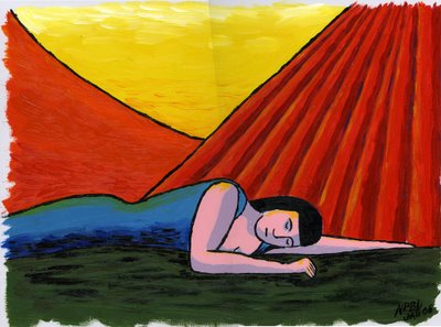
And so to the final piece. At the very beginning, I knew this would be an acrylic, rich in colour and texture. So far, nothing I had created had changed my mind about this; each version of the sleeping lady had been a way of getting to know her better. The original sketch had settled her form very well, and the subsequent pencilled versions had helped confirm the colours that I wanted. The watercolour had let me practice creating a "real" painting of her, and had given me the chance to experiment with texture and shading, so that I had a good idea of what I wanted in the final piece.
The sleeping lady is painted on A3 acrylic board with a canvas texture on the top. I love this particular type of support: it's light, firm to work on, and very durable. You don't have to place it on an easel to work with it (I have still not made up my mind whether I prefer working on an easel or not), and it's reasonably cheap as well. It's great for acrylics, and I presume for oils as well, though I have never painted with oils.
First of all, I sketched the sleeping lady for a third and last time, directly onto the board. You'd think I'd be pretty familiar with her by now, but funnily enough this was the hardest part of the acrylic, and it took three or four attempts before I was satisfied with the result. I put this down to the difference between trying to achieve a particular thing, and happy circumstance. With the original pencil sketches, I arrived at the final shapes easily, more by luck than design. It had been those original sketches that had confirmed what I wanted. When I drew the sketch for the watercolour, I knew that it wasn't my final piece, and so I suppose I was less fussy. By the time I got to the acrylic, I had a very fixed idea of what I wanted, and getting it proved to be less easy!
One of the things I love about acrylic painting is that you have to work so quickly; it is a totally absorbing medium to work in because once you start, you can't just put it aside. Unlike watercolour, where you can reinvigorate a colour with some water even when dry, once an acrylic is dry, you can do nothing other than paint over it. For this reason, I tend to divide acrylic paintings into sections in my mind, ensuring that I can complete each section successfully before moving onto the next. This allows me a number of stopping points in my work, should I need to do something else. Planning the painting in this way means that I won't have to leave it in a state that I might later regret.
For the sleeping lady, the painting divided naturally into six sections: the sky, the hill, the curtains, the lady herself, and the ground. The last section, not really an area of the painting, was to put in the outlines.
The rule of thumb, at least for me, is to start with the lightest, and the topmost. In this case, it so happened that the painting started off light at the top and got darker towards the bottom, so my approach was clear. I started with the yellow sky first, laying down a thick base layer of yellow and then working in white at the top and orange at the bottom before the yellow had dried.
The hill was next, and this was fairly similar to the sky. Lay down some orange, and blend in a little red towards the bottom.
The curtains were trickier. I had marked each fold in the pencil sketch, and so I started off by filling in the gaps between the folds with the lighter red colour. I then mixed in the darker colour and painted over the folds; by this time the lighter red was beginning to dry, which is why the boundary between the dark and the light is better defined in some areas and more mixed in others: an effect that happened by chance but which I liked in the final result. Once the curtains were completely dry, I carefully overpainted some highlights in yellow, and darkened some of the folds by painting faint blue lines.
Next came the lady herself, which I suppose was really two sections in itself: the skin and the dress. The skin divided neatly into shaded and unshaded areas, and I didn't want to blend the two, so painting them was straightforward: I mixed two shades of pink, one using some grey and blue, and painted the relevant areas. After starting, I worried briefly over whether I had the shading correct. I suspect it's not natural around her neck, but I quickly decided not to worry about it, and just to go with my instinct.
For the dress, I had to get exactly the right shade of blue. I'd had this shade in my head since the very start, and I was a little worried that I wouldn't be able to reproduce it on the page. As it happened, I needn't have worried, since I mixed the right shade almost straight away. I combined this with a darker blue and a bit of yellow to suggest shading and highlights in the dress. I'm still not sure about the yellow highlights -- I added a few to her skin as well -- and they're the part of the finished painting that I'm least pleased with, but the effects are pretty muted, so probably not worth worrying about.
The ground was easy. Some very dark green, overpainted with some brown strokes.
Lastly, I needed to add black to the picture. I was pretty nervous about doing this, because one mistake could have ruined the picture, and yet I wanted to capture a roughness in the outlines that I hadn't achieved in the earlier paintings, and painting too carefully wouldn't have allowed me to do this. The use of black really went back to my earlier admiration of Anita Klein's work: natural, almost carefree outlines, using a paint brush to capture shape as a child does, rather than to paint. Well, I didn't achieve that, but I was pleased with what I did achieve: shorter brush strokes to give a thicker, blockier effect. Lastly, I darkened the shading under her dress and on the ground fairly crudely using black -- another trick I had picked up from Anita Klein -- and I was done.
I hope you like the end result; I do. I still have no idea who the sleeping lady is, but whatever her identity, I hope she's having sweet dreams!
The original inspiration for this piece came from the artist Anita Klein . I was walking to work early one morning and passed a gallery that included one of her pieces in the window. I was immediately struck by the deceptive simplicity of her work. Beautiful colours, incredibly assured brush strokes, bold shapes. I knew that I wanted to try something similar to this, and the idea for the sleeping lady sprang immediately into my mind.
One of the things that I love about sketching and painting are the times when that happens: a picture just leaps into your mind. Usually, it's inspired by some event, no matter how small. Something you've seen, usually, or perhaps a photograph you've taken, but it can sometimes be something you've heard, or something you've discussed. But no matter what it is that's inspired you, I find it amazing that an almost complete picture can form in your mind from just the grain of an idea. The challenge then becomes to transfer what is in your head onto the paper -- and there is the real challenge! If you can get within 90% of your original idea, then I think you're doing well, always assuming that your original idea doesn't change along the way of course!
With the sleeping lady, I saw this woman (who is she? I still have no idea), asleep, presented using simple, almost cartoon-like lines. The background needed to be unidentifiable, and possibly even ambiguous. Her location was totally unimportant to the piece other than as a way of framing her: is she on a bed or on the ground? Inside or outside? That's up to you. They key to this piece was going to be the colours. I wanted very bold, brave colours, and if they weren't right, then the whole piece would have failed.
 So there it was: the grain of an idea, taken root while walking to work. The first thing I did was write it down in my Moleskine. If an idea is worth a grain of salt, I need to write it down. This isn't just a memory thing: writing it down is almost like a proof of concept. If I can write the idea down, come back to it at a later time, and decide it's still a good idea, then it's probably worth doing. Some of my favourite pieces (other than sketches that have just been done on the spur of the moment) have started with entries in my journal. You'll notice that I didn't include any details at all in my journal; just a record of having had the idea was enough on this occasion.
The first sleeping lady was the pencil sketch I've already posted. Funnily enough, the basic
 shapes for this version came very easily, and changed little during the various phases of this project. I sketched the rough shape of the lady using a B grade pencil, put in a little background detail, and then went over the outline in more detail using a dark sketching pencil. At this point, I thought to scan what I had, even though I intended on adding colour. I knew that the colours I chose were going to be essential to this piece, so I wanted to be able to produce several versions easily so that I could experiment later on.
Next, I needed to add a little colour.I knew I wanted a bright red, and a rich, turquoisey blue. I thought orange would be a good contrast to the blue as well. And what to lie on? A dark green was as good as anything; funnily enough it was this dark green that ended up changing the least. Having chosen four colours, I went on to colour the original sketch. I used standard colouring pencils, partly because it was quick and I knew I'd need to experiment with the colours, and partly because I just wanted to try using some colouring pencils -- something I hadn't used since I was a kid. Hey, this was just like a colouring book!
 I was pleased with the result -- pleased enough to post it to Mr. Porkpop -- but I knew that this was just the first stage in getting the colours right. The first task was to identify the range of colours that was best, and where they worked best in the image. The next day I printed out two copies of my original scan and coloured them in using different schemes.
Now these were very rough, and at the time I never intended to post them; I'm only including them here to show what an important stage in the process it was. One of the sketches -- the one with the orange dress -- seemed obviously "wrong" to me. Repeating the orange in the background just didn't work. The other introduced an important new concept: another colour! I'd added a yellow background just to break up the image a little after
 the "orange dress" sketch looked so wrong, and in doing that, the obvious jumped out at me. I had five regions in the image, so I needed five colours. But this second rough version worked in another way: the blue dress. I had always felt that blue was going to be the pivotal colour in this image (although at this stage, I hadn't even come close to producing on paper the blue that was in my head), and so to make the woman's dress blue seemed like the obvious thing. I knew then that I had my colour scheme.
At this point I put the piece to the back of my mind for a few days to enjoy the Christmas break. I knew that I wasn't finished with the sleeping lady, and I was becoming more and more convinced that her final "form" would be as an acrylic painting, but I knew I wasn't ready to dive straight into the final version, and I didn't know yet what the next stage was going to be. A change can be as good as a rest: after a few days I knew that I need to do a test piece in watercolour.
 I had a number of reasons for wanting to do another test piece. Firstly, I wanted to try something on a larger scale: all the sketches so far had been small, on A5 paper, so I wanted to try something on A3. Secondly, because the previous sketches had been coloured with pencil, they had been fine for getting the colours approximately right, but I wanted to continue to experiment with them. Lastly, it was really a case of elimination: I thought that my final piece would be an acrylic, and if I tried a watercolour first and still wanted to continue, I could be certain.
To recreate the sleeping lady for the watercolour, I sketched her from scratch on A3 cartridge paper. When it comes to reproducing images several times, I use a variety of techniques, and tend to go with my mood on the day. Sometimes I'll scan the original picture, overlay a grid on a print-out of the scan, and then reproduce the contents of each grid square for the new image. Other times, I'll trace over the original image. Often, I'll just draw the image again from scratch. For this picture I opted for the last of these methods because I wanted to retain a certain spontaneity in the piece, and I was confident that it was an image I could reproduce fairly well.
The watercolour also gave me a chance to practice the heavy black outlines I wanted to use on the piece. For these, I used undiluted black paint to achieve a heavy look. It worked well, better than I had expected, to be honest, but there was a certain spontaneity missing that I wanted. The outlines in the watercolour seemed to contrived, somehow, and one of the things I had admired about the original Anita Klein was the natural, almost carefree approach of the outlines in her piece.

And so to the final piece. At the very beginning, I knew this would be an acrylic, rich in colour and texture. So far, nothing I had created had changed my mind about this; each version of the sleeping lady had been a way of getting to know her better. The original sketch had settled her form very well, and the subsequent pencilled versions had helped confirm the colours that I wanted. The watercolour had let me practice creating a "real" painting of her, and had given me the chance to experiment with texture and shading, so that I had a good idea of what I wanted in the final piece.
The sleeping lady is painted on A3 acrylic board with a canvas texture on the top. I love this particular type of support: it's light, firm to work on, and very durable. You don't have to place it on an easel to work with it (I have still not made up my mind whether I prefer working on an easel or not), and it's reasonably cheap as well. It's great for acrylics, and I presume for oils as well, though I have never painted with oils.
First of all, I sketched the sleeping lady for a third and last time, directly onto the board. You'd think I'd be pretty familiar with her by now, but funnily enough this was the hardest part of the acrylic, and it took three or four attempts before I was satisfied with the result. I put this down to the difference between trying to achieve a particular thing, and happy circumstance. With the original pencil sketches, I arrived at the final shapes easily, more by luck than design. It had been those original sketches that had confirmed what I wanted. When I drew the sketch for the watercolour, I knew that it wasn't my final piece, and so I suppose I was less fussy. By the time I got to the acrylic, I had a very fixed idea of what I wanted, and getting it proved to be less easy!
One of the things I love about acrylic painting is that you have to work so quickly; it is a totally absorbing medium to work in because once you start, you can't just put it aside. Unlike watercolour, where you can reinvigorate a colour with some water even when dry, once an acrylic is dry, you can do nothing other than paint over it. For this reason, I tend to divide acrylic paintings into sections in my mind, ensuring that I can complete each section successfully before moving onto the next. This allows me a number of stopping points in my work, should I need to do something else. Planning the painting in this way means that I won't have to leave it in a state that I might later regret.
For the sleeping lady, the painting divided naturally into six sections: the sky, the hill, the curtains, the lady herself, and the ground. The last section, not really an area of the painting, was to put in the outlines.
The rule of thumb, at least for me, is to start with the lightest, and the topmost. In this case, it so happened that the painting started off light at the top and got darker towards the bottom, so my approach was clear. I started with the yellow sky first, laying down a thick base layer of yellow and then working in white at the top and orange at the bottom before the yellow had dried.
The hill was next, and this was fairly similar to the sky. Lay down some orange, and blend in a little red towards the bottom.
The curtains were trickier. I had marked each fold in the pencil sketch, and so I started off by filling in the gaps between the folds with the lighter red colour. I then mixed in the darker colour and painted over the folds; by this time the lighter red was beginning to dry, which is why the boundary between the dark and the light is better defined in some areas and more mixed in others: an effect that happened by chance but which I liked in the final result. Once the curtains were completely dry, I carefully overpainted some highlights in yellow, and darkened some of the folds by painting faint blue lines.
Next came the lady herself, which I suppose was really two sections in itself: the skin and the dress. The skin divided neatly into shaded and unshaded areas, and I didn't want to blend the two, so painting them was straightforward: I mixed two shades of pink, one using some grey and blue, and painted the relevant areas. After starting, I worried briefly over whether I had the shading correct. I suspect it's not natural around her neck, but I quickly decided not to worry about it, and just to go with my instinct.
For the dress, I had to get exactly the right shade of blue. I'd had this shade in my head since the very start, and I was a little worried that I wouldn't be able to reproduce it on the page. As it happened, I needn't have worried, since I mixed the right shade almost straight away. I combined this with a darker blue and a bit of yellow to suggest shading and highlights in the dress. I'm still not sure about the yellow highlights -- I added a few to her skin as well -- and they're the part of the finished painting that I'm least pleased with, but the effects are pretty muted, so probably not worth worrying about.
The ground was easy. Some very dark green, overpainted with some brown strokes.
Lastly, I needed to add black to the picture. I was pretty nervous about doing this, because one mistake could have ruined the picture, and yet I wanted to capture a roughness in the outlines that I hadn't achieved in the earlier paintings, and painting too carefully wouldn't have allowed me to do this. The use of black really went back to my earlier admiration of Anita Klein's work: natural, almost carefree outlines, using a paint brush to capture shape as a child does, rather than to paint. Well, I didn't achieve that, but I was pleased with what I did achieve: shorter brush strokes to give a thicker, blockier effect. Lastly, I darkened the shading under her dress and on the ground fairly crudely using black -- another trick I had picked up from Anita Klein -- and I was done.
I hope you like the end result; I do. I still have no idea who the sleeping lady is, but whatever her identity, I hope she's having sweet dreams!
Friday, March 10, 2006
Concentrating on a Gameboy
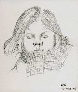 On the train after a trip to London to see the Science Museum. My youngest daughter slumps on the seat opposite me, tired, footsore, and so wrapped up in layers of clothing that they seem to swamp her (it's been a cold day). Clothing isn't the only thing she's wrapped up in, because she's playing on her Gameboy, unaware that I'm sketching her. She looks as if she's asleep, but actually she's on Level 4.
Mr. Porkpop is a year old today: it's a year since I wrote this post. Sorry Brenda, no time to draw you a cake, but hopefully I'll be able to post something more interesting in the next few days. Did I think I'd still be here, posting sketches, in a year's time? I hoped I would be, but I had no idea.

Subscribe to:
Posts (Atom)
